Showing posts with label illustration. Show all posts

X-men Rogue

This week's post is coming a little bit early and I am headed out of town for the next week or so.
I didn't want to leave you guys without a post for the week. So this week I decided to take a bit of a break from the Nintendo book and try something different. I don't normally do superheroes (although I love them)..but since everyone else does it I like to be different. However, in the spirit of doing different things, I decided to try and paint over someone else's lines, which turned out to be pretty awesome.
I have been following this guy and Deviant art for a while (http://weaponx5203.deviantart.com/).
One day I asked him if I could pick something from his gallery and paint over the work.

He said "sure" and below is what I got:
Here are the steps to get to the end result:

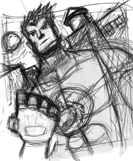
1. Below: I picked the sketch of Rogue from the gallery it was the one with the cleanest lines and I was a fan of the sketch. I heard a lot that the key to a great painting is the sketch and the drawing underneath and it's really true. If you have a crappy drawing no amount of painting over it is going to fix it. See the sketch below:
2: Below: then I added a background gradient to set up the color tone of the painting:
3: Below: One tip that I picked up is before you start laying down any permanent lines, you should do some color tests. This means that you can try different color schemes and see which one works the best. Even different color backgrounds as well. In this case I kept the background green because it goes nicely with the yellow in Rogue's costume.
4: Below: I start to add color flats and the shadows and I make the decision that the light should be coming from the top right side of the image.
5. Below: One tip that I learned that also helps was to use a wireframe form lines to try and define the shape. This helps to keep the image from being flat, helps to define the form and helps when adding shadow and defining the form.
6. Below: Shadows added
7. Below I start to go over the lines and do the paintover. I will usually leave the light source indicator in place to serve as a reminder as I work.
8. Below is the final! Shout out to Weaponx for letting me paint over his work!
See you in a week guys!!!!!

http://murdockink.tumblr.com/
http://moebocop.deviantart.com/
http://twitter.com/mauricemurdock

Nintendo Tribute: Double Dragon

Ok, so the next in the Nintendo tribute series is Double Dragon. You played as one of two brothers or friends (I think), who had to fight your way through hordes and hordes of street gangs to rescue your girlfriend. For this particular piece I decided to try to work on anatomy, but do it in a simplified manner to suggest the form, but not go overboard with the details. Hm. It took me a while to post this one, because I wasn't too hot on how it came out, however since I need to finish things I decided to post this one as a means to move onwards and learn from my mistakes. (Practice practice practice).
Steps are below:


In the end, it's not the worst, but in practicing I learned a few tricks a long the way to make the painting process easier. If I go over my original sketches and create a simple line drawing, that will eliminate having to work so hard when starting the color phase. Also, anatomy anatomy anatomy and values. Very hard to master, but I will be psyched when I get it. So that's it for this one, next up is Jimmy Lee (Double Dragon part II).

http://murdockink.tumblr.com/
http://moebocop.deviantart.com/
http://twitter.com/mauricemurdock


Mighty Bomb Jack (Process Post)

I have been trying to think of a these for the MOCCA fest book that will be out for the April show. I think that for the first official book, I am going to do a collection of paintings/pieces from Nintendo games that I grew up playing (and there were a lot). One of the first games that I grew up playing was Mighty Bomb Jack (a game where you were super hero who had to collect bombs and avoid mummies and floating skulls. Very fun!)


One of the things that I have learned was that I need to focus more on shapes and composition. I did a number of sketches to try and figure out what the best composition would be (below)
Then I scanned the composition/sketch that I liked and then went over it again in Photoshop and Painter. I then started to add the shadow values an tried to keep the light source in mind. (below)

I then started to add in the flat colors on a new layer (I started with the center figure first). (below)
...then continuing onto the background layers after..(below)
Then finally I covered everything with a paintover layer, added the textures, lighting effects and final polish. (below)


The Bronson


Today I got my last print back from the printing place, and it's my favorite. This will also be one of the pieces that I will be showing as a part of the Digable Arts Fest this coming weekend. All in all there are about 6 pieces (this one being the last...and personally my favorite). The only issue that I discovered in the print was the fact that there was some colorizaton and some pixelation happening. That's because I forgot to convert to grayscale before I sent this off to the printer. Opps...
Now I know for next time though.

This print will also be on sale in my society 6 store.
http://society6.com/mauricemurdock

The last step is to get some foam backing done, which should happen this week, and then I should be ready to hang this coming Friday! Sweet!