Showing posts with label lettering. Show all posts
Contest!

I'm suffering my annual resurgence of a mono-like virus I picked up a few years back, and don't have it in me to put a post together, but I didn't want to just call in sick, so I'm holding a fun little contest.

You may remember my post about lettering, where I showed many of the most common mistakes I see in amateur lettering, and gave a general philosophy about how artists can approach this intimidating subject.

This last week it was announced that the Twilight graphic novel was going to print, and that they'd be making 350,000 copies for their initial print run, an insane number for a comic. As it turns out, Stephenie Meyer cares even less about how her books are adapted into comic form than she does about how they're adapted into film, or for that matter the quality of her writing. Stephenie could certainly pay for quality, if she wanted, but instead chose first-time comic book artist Young Kim (who, it's reported rather vaguely, has a "fine arts" background) for the job. Kim's too-shitty-to-be-called-generic, obviously hastily produced hackwork is hysterical, confusing, and infuriating. It's hard to see how such a terrible artist was chosen to helm a GN with one of the largest print runs I've ever heard of. Maybe Meyer saw in Kim a kindred spirit with absolutely no pride in her work? Meyer has stated that she was involved in every page of the book, and feels very happy with it. But the artwork actually wasn't what caught my eye first. The lettering in this book is literally- and I use that word mindfully- literally the worst published lettering I have ever seen. If I'd known lettering could look this bad, I'd have requested that Meyer actually piss in my face instead.

Here's where we get to the contest. In my post I covered nine distinct types of mistake one can make in lettering. I counted eight major types of mistake in this lettering, and four of them were ones I didn't think of when making my post. Here is a single page from the new book:


The first person who can tell me what those types of mistake were, and which ones I did not cover in my post, will win a signed print of my poster for Patton Oswalt:

Leave your answers in the comments. I'll let you know when I have a winner.

Have a good week everyone!
This week: Brush discussion, and turning Patton into the Moon.

First off, for all those concerned, my fingers have healed creepily well, to the point where I have fingerprints back except on a very tiny bit on my thumb, and they're growing in there too. If you want to see what they looked like after one week, click here. Do NOT click if you're squeamish at all. My thumb, which got the deepest cut, is still a tad tender, but they're both up and running with honest-to-God skin. The skin was really dry until the last few days, because my new sebaceous glands hadn't grown in yet. Now I can sweat and produce oil, so it doesn't look like I have crazy localized eczema.

So, there was a lot of conversation about last week's topic and my retraction of my endorsement of Rosemary and co's brushes, and I'd like to discuss and clarify a few things about that, while also rolling in a couple items that Chris Schweiser gave me to review when I was at SCAD Atlanta.

In the comments Kiel provided a link to a fantastic primer/comparison on five different name brand brushes on artist Mike Crowell's site. Mike has, without reservation, the worst artist web page I have ever seen in my life, which is saying a lot, which makes it all the more bizarre that this amazing tutorial is just sitting there amongst the 4 other pages of his site, which include a home page consisting almost solely of a terrible photo of him, an art page with 2 pages of art, a page with nothing but am email address, and a links page. His brush lesson is as good as the rest of the site is bafflingly poor, and I learned some new things from it. It also serves as a great primer for the point I want to make, which is about consistency and/versus quality.

Mike's brush page confirms yet again what I and many others have always said- they don't do it often, but when they do, Windsor and Newton makes the best brushes in the world. But if you just broke/lost/ruined your brush and you need one NOW for a project, you can't afford to go to 3 different stores and try every brush looking for one that works, and possibly not even find one. (This has happened to me- twice.) Everyone I know who doesn't use Windsor and Newton either never used a great one and abandoned them early, or used them for years until the quality control dropped so low they got frustrated and jumped ship. But the fact is, there are people out there still using 20 year old W&N brushes. I've used my #3 like I hated it for 6 years now and it's still as good as new. Windsor and Newton , a GOOD Windor and Newton, is a mythical beast, the brush that all other brushes aspire to be. As a brand, they suck and are FLAKY inconsistent.

Raphael is the brand most people jump ship to, and with good reason. You still need to test them, but their QC is much better than W&N. You can actually find a working Raphael brush in one store stocked with them almost every time. If you ordered five I'd give you great odds more than one would work. And their best brushes are just a hair under a good W&N, which is like being a shade slower than the Millennium Falcon but not breaking down nearly as much.

The reason I was so excited about Rosemary was not that they were amazing quality brushes- they're not. They are perfectly effective, however. A good Rosemary brush is like what I'd picture a solid military issue brush to be like- it lacks finesse, but it's solidly built and in skilled hands will get the job done. Rosemary brushes won't hold as much ink and have less spring than better brushes, but because every single one I and everyone else ordered was a perfect example, I recommended them because she was the most consistent. Rosemary brushes were, I thought, the first brushes I'd ever seen where you could order ONE brush and get a working brush every time, guaranteed.

But now I semi-frequently have reports sent to me of people ordering brushes from her that are a little off. Now, sure, she has a policy that she'll replace anything you're not satisfied with, but the point was, she was a slightly lower quality but still good brush that I was recommending because of their insane consistency. So if she lacks the consistency, and she doesn't have any edge on quality, why the hell not just tell you to rummage through the art store for Raphaels?

So it is on that basis that I retract my endorsement. I say put your effort and money into a higher quality brush. You really do get what you pay for with brushes.

Mike's brush page has a section towards the bottom about identifying quality brushes that's more specific and informative than anything I've ever posted, so you should read that, maybe even print it out and take it with you when shopping. He inspects every bristle, and if you've ever used a brush you know that's not fanatical- one splayed hair will ruin a brush. It's like a grain of sand in a Swiss army knife.

According to Mike Raphael and Scharff brushes are essentially identical in constriction and quality control, so if you need to dash out to buy one they'd both be good choices. I have never heard of ANYONE being disappointed with either. However, because mora brands means more likely hood you'll be able to find a brush if you need to find one fast, allow me to toss in a brand that's only become recently available in America, but which seems to be in growing demand amongst the students at SCAD's Atlanta campus: the Escoda, made in Tajmir, Spain.

Here you can see the #2 Tajmir on top, over my trusty #3 W&N, and my #2 Rosemary. Click to see the image larger.
I wish I had a #2 Windsor to show you how the belly's compare better, but you can see that the Escoda has a better belly than the Rosemary, though not as much as the W&N.
A simple line test showed that indeed, the Escoda holds far more ink than the Rosemary. I wish I could compare it to other brands, but I don't have any. It feels to me slightly wispier but just as springy as the Raphaels I've tried. It's a good brush and several SCAD Atlanta students and faculty seem to just love them. Chris claims the quality control is very good on them. Look for them if you're ever out brush hunting. If nothing else, it's another good option that increases your chances of coming back home with a tool you can draw with. While I was there Chris also gave me a bottle of a new Japanese ink I'd never seen nor heard of that's carried in a local art supply store that caters to the cartooning students. It's called Holbein ink. According to their company profile they started in 1900 a a Japanese company producing "European" artist materials (They do not elaborate), which presumably explains why they chose a German name. Like everything I've ever bought from Japan, the ink bottle comes in nifty, crazy sturdy plastic packaging that you don't have to destroy to open.

Here you can see the Holbein logo in a calligraphic font, with an Iron cross over it, because I guess that's what the Japanese thought people would think was German at the time.
As usual, I LOVE Japanese infographics.
The ink is one of the best I've ever tried, continuing Japan's total dominance in modern ink making. It's matte and deeply black, sort of like Dr. Ph. Martin's Black Star Hi Carb ink. I like this ink a little better. If you can get ahold of it, definitely try it. My understanding is that it comes in two thicknesses, this one, and another that is very thick and actually needs dilution before use.

Changing subjects, remember how I said you'd crap yourselves when you saw what was delaying me? It was Two large poster projects, one of which I can't show you just yet, but the other of which is finished, and I'll share it's making with you below.

First off, some of you may recall a ways back last year when Patton Oswalt had me do this poster for a show of his:


Well, he liked that one so much had asked me to design the postcard for another show.

I needed a fairly simple design that would read easily at a small size, and something that would force people to look at it, which as every artist knows means face, eyes, hands, boobs or any nudity. Patton has a fantastically expresive and distinctive face (He's one of the comedians who I think almost all of his fans know what he looks like), so I decided to go with his face. Plus, I already knew how to draw him, so that would save time.

You can now follow along with my process by matching the numbered paragraphs to their matching numbered picture:


1: This was my first doodle of what would turn out to e the final composition, although I did more than 30 other drawings to make sure, as is usual with me on illustrations. Illustrations aren't as intuitive for me as comics, and require a lot of planning. I throw away a lot of work doing illustrations. Obviously, the concept is to have his head be the moon from "La Voyage Dans La Lune." The twist is that the rocket in his eye is actually the LCross rocket stage that was launched at the moon to look for water. It took me 3 hours to find 6 good, accurate images of this goddamned thing:
The probe is the gold thing on the top.

2: This was a computer sketch I did to establish the basic lettering shapes in the title, which was to be hand-lettered, and of the overall image. I like using digital when I have to do a lot of drafts to figure out black balance but not necessarily a lot of redrawing.
3: I penciled his face and then found myself stuck for about 2 days as to how the hell to make him look like his head was the moon without making him look like he had a terrible skin condition. Nothing was working. I got really frustrated with the delay when Patton wrote me asking if it was done so he could post it for New Years and I had to tell him no.

4: Finally, I figured it out and successfully tested it it on the computer: instead of making his head the moon, I'd do what the original filmmakers had done- apply the moon like a mast around his head, with his head sliiiiiightly pushing out from the moon, so you can still barely still see his original jaw line, but then stretching his hairline and ears out to the edges of the moon. It worked perfectly- still recognizably Patton, but looking like the moon from the film.

5: Next came the pencils, for the drawing, border, and hand lettering.

6: Then came the inked lettering, which you see me holding here for scale:


Hand lettering is generally drawn large when a very smooth finished product is needed; reduction eliminates any mistakes. I also added in the rest of the lettering, a tedious process, because I wasn't using a computer font, but rather an old font that I'd scanned in and modified slightly. I had to place each and every letter by hand.

My girlfriend swooped in and gave me some help with this- she is absolutely excellent at spacing type, and her adjustments made all the difference in the world.

I emailed Patton about whether his current hairstyle matched the one I used in this drawing, but he never wrote back. As it turned out I didn't need him for that one, because that very night he was on the Tonight show, and I was able to see his hair there and adjust my drawing accordingly. (I ended up making is a mishmosh of about 4 similar hairstyles like his current one, figuring it would be more recognizable to average them.)

I had an incredibly odd moment inking the drawing. I was getting fristrated drawing the Lcross booster and I decided to move in to his face for a bit to relax (I like to eat my veggies before my meat, so to speak), and as soon as I started inking his eyebrows Patton called in live to the Best Show on WFMU, which I was listening to, so suddenly I was getting Patton through the eyes and in the ears at the same time. My night suddenly became a Russian Nesting doll of Patton. I tried emailing him to see if I could get him to talk about how I was listening to him and drawing him at the same time while he was still on the air, but he didn't get it till after. It was worth a shot.

It had been awhile since I inked anything, and in my rustiness I over-inked the left side of Patton's face, requiring me to lightbox that side and re-ink it, as you can see here: 7: I drew the border with a thick bamboo skewer and then inverted the image in photoshop.

8: And voila, the finished product, which you can see better below: (Click to enlarge)
I'm pretty damned proud of it. It's by far my best lettering job, and I love the composition.

I look forward to when I can show you the other poster I've been working on. It's still in development right now.

Finally, I thought you all might like this funny shot of me looking out of the eye window in my camera mask, which allows me to look at things for real and not just through the camera's rear screen. Next week: My visit to SCAD
This week: Balloon Shape.

This entry isn't about what you probably think it's going to be about. I suspect you think I'm either going to talk about the various shapes of balloons you can use in your comics, (round, cloud, square, unfurling scroll, etc.) or about how to compose your balloons within your comic panels.

Neither of those would be worth discussing on Comic Tools, not because they're not important, but because they're both extremely broad subjects of discussion which are very, very well discussed in many books and websites already. The reason I let myself get away with tutorials on comic tools is that I only talk about things I call "mental tools," little tips and tricks that you can keep in your mental toolbox and use to make your art easier and better. Subjects of broad aesthetic discussion are for the artist in you- Comic Tools blog is for the craftsman in you.

This week I want to bring something clearly into everyone's mental focus that they may or may not think of, but which very few people think of enough, if at all: The shape of the outline of the balloon is as important as the shape formed by the negative space inside the balloon, and the shape of the negative space inside the balloon is as important as the shape of the words inside the balloon. The words, the negative space, and the balloon's outline all have to combine into a single, pleasing form.

Many cartoonists, and most beginning cartoonists, look at text as something they have to either put over or cram into their art. This is because most young cartoonists "just want to draw," and don't want to have to deal with it. By the time anyone has gotten to a point of being even a little professional they've at least caved in to the idea that they actually have to leave room for balloons or their work will look like shit and be totally unreadable. Most even go to the effort to compose their pages by using the balloons as a visual element to lead the eye through the page, recognizing them as a part of the image and not just something they have to make room for.

But many professionals, even many good ones, stop there. They'll compose the balloons on the page, but they don't think about composing the balloon itself. And thus their balloons keep making their art look worse, and thus they keep hating text.

An average of 30% of your comic page might well be word balloon by area- it's worth taking the time not to make a third of your page look like garbage.

The problem with text, from a drawing perspective, is you can only do so much to change it, especially if you're working off a script you can't re-write. Those words are going to be that size and that spacing. You can't draw the word from a different angle, or from above, or in perspective to make it thinner. It's frustrating, how unmoldable they are, how undeterrably horizontal. All you can really do is stack them into a shape that's easy to draw a balloon around.

Most young cartoonists don't even TRY. I'm sure every one of you has seen a comic with one or more of these mistakes:
The problem on the top left is different from all the others in that it's a mistake made by cartoonists who are just starting to try to address the relationship of their text to the balloon but don't quite have the hang of it. I did it for awhile and so did many of my classmates at SVA. It happens when you keep drawing your balloons around your words and leaving huge amounts of space around them here but almost crashing the edge against a letter somewhere else. The teacher or a fellow student will say "You need to be leaving more equal space around your words, imagine there's a forcefield around the letters you can't cross." But then you take them too literally and you draw these spandex-fit balloons that really are like drawing a forcefield around the text.

If you're still doing that? It's time to graduate. although it IS important you have space around your words, it's not important that the space around them be equal. It's important that the space around them, and the words themselves, form a pleasing shape.

Let's take a phrase and I'll show you what I mean.

Below I've misspelled "I am a very hot Paleontologist, yes." seven times, in different arrangements. I've eliminated some, approved of others, and I'm iffy on one. Have a look at them and then I'll explain why.

Alright, now below are those same arrangements, but with the shape of the letters emphasized:

1 is just a boring shape, and being rectangular it's hard to form a pleasing oval around. But it used space pretty efficiently, so I marked it as lukewarm, a shape I might use is I had to but one I'd avoid when composing my page.

2 and 3 are pointy, nasty shapes that waste previous room on my page with empty and not very artful lumps of negative space. I can do better, and I can think of no reason why I'd use them.

4 and 5 are both more efficient at using their space and form stable shapes that are easy to draw a balloon around. I like to plan versions that will float as well as versions that I can bodge against the panel border if I need to, so I have options when I got to compose the panel.

6 is another inefficent waste of space.

7 is not only a better shape, but it's more compact, despite being an extra line. Should I choose to put this balloon in a corner this will take up the least of my drawing and do so very attractively.

When composing a page I figure out the best balloon shapes for the text first, and I compose only with the ones that pass. This way I know for sure that the text will look great later- I've already eliminated all the bad options!

Doing this not only makes the page look better, it makes the page read better. Text that gets forgotten till later usually gets crammed in, and cramped text actually has quite a detrimental effect on a reader. Read these two balloons with identical text, and pay attention to your eye strain, and even your level of stress, as you read one, and then the other:


If you're running a balloon up against the side of a page you also have to decide whether you're going to have the letters run flush against the border or be centered in the balloon. You have to draw the balloon differently for both. Also, you either have to have the balloon up against the border or totally away from it, having them tough forms and unattractive and awkward to draw around tangent:


When everything is working well, the reader should notice as little as possible that they're even reading. It's for this reason that I'm also typically of the opinion that text should be kept absolutely as simple and innocuous as possible. The goal is to be not noticed, so as not to pull the reader out of the story.
Using very regular, innocuous text also make composing much easier. However, as anyone who's read my comics knows, I DO think there's times where it's appropriate to draw attention to the text for effect:

I think a lot of folks associate bad lettering with digital, or computer lettering, either as seen in crappy mainstream comics or in englich Manga translations where the letterer is rarely an artist, such as these examples:
They're hilariously bad, to be sure. But let's not forget that plenty of great artists who did all their lettering by hand have made the same mistakes. Bill Watterson constantly ran out of room and had to bodge the rest of a long word in by drawing all the letters small, and Winsor McCay, one of the greatest cartoonists of all time, may well have been the worst letterer of all time. (Which is odd, since his title lettering was breathtaking. I think it's because he thought of the titles as drawing and his balloons as text.)

I think it's just easier to see mistakes in digital lettering, and that mistakes look worse in digital lettering, because everything is so regular and clean. Doing things by hand gives you a little leeway.

Two of my favorite letterers who use digital are Steven Griffin and Bryan Lee O'Malley.

Just look at the letter shapes in this spread from Hawaiian Dick, which Steve colors and letters:


They're immaculate. They sit there like perfect jewels. I envy the shit out of this guy. You can't see it here, but his colors make me foam at the mouth with jealous rage too.

I've always loved Bryan's combo if hand drawn balloons and computer text (some of the most tasteful computer text I've ever seen), but what's really unique and interesting about his lettering is how most of the time he composes his balloons so they only have one or two worse across running down his distinctive tall balloons in a punchy column.

Sometimes he'll let them get wider and grow into fat circles, but unlike just about every letterer I've ever seen, O'Malley defaults to the vertical, rather than the horizontal. The result is that instead of reading a block of text, I meander through the character's words as they speak. It makes for a unique reading experience.

Next week: The marvelous erasers of Japan
This Week on Comic Tools: Things you should read

I think I have the only blog dedicated solely to the kind of information I post about, but I'm certainly not the only one posting about their tools and technique. And thank goodness for that, because the gaps in my knowledge are so big a drunk oil tanker pilot could careen through them without being in danger of hitting the edges. I love following artist's blogs not only to see their art and keep up on what's going on with them, but also because every so often they'll post a tip or tutorial, and very often they'll fill in those holes just a little bit more.

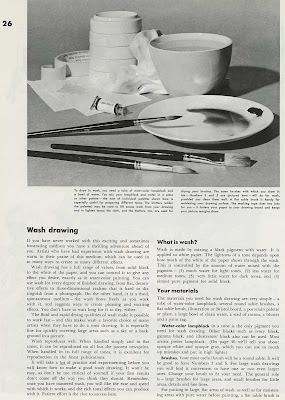
One of the hugest, most glaring gaps in my knowledge is ink wash drawing. I know how to work in Guache and watercolor, but ink wash is something I know nothing about. So when Comic Tools reader Andrew emailed me requesting an entry about ink wash drawing, I lit up the Comic Tools signal in a plea for help from the readers. And boy, did it pay off! Reader's Raluca and Sarah left great information from their experience in the comments for that entry, and then Mark linked me to the greatest tutorial I could possibly imagine, a 14 page exerpt from a larger text titled "Famous Artists on Wash Painting. " It's exactly the kind of hyper-detailed, excessively specific, sort-of-bossy old-fashioned art tutorial writing that I bade my writing for Comic Tools off of. Comic Tools is, in fact, a pale, crappy imitation of exactly this sort of thing. Mark, if you're reading this, I want to kiss you, and probably so does Andrew.
Andrew, I give you Part one and Part two of the ink washing lesson. Click on all the pages to make them larger. And Mark, bless you, sir, you are a scholar and a gentleman. I notice that the site the tutorials are posted on asks for donations- if anyone has the money, you really ought to toss them something for making these resources available. I'm going to root around their site when I have more time, and I'll very likely find more there that I'll want to link to here.

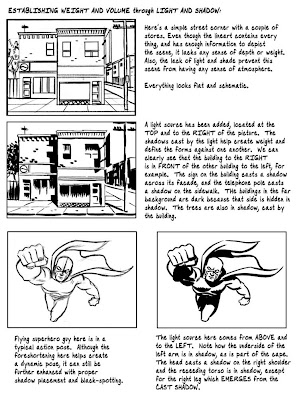
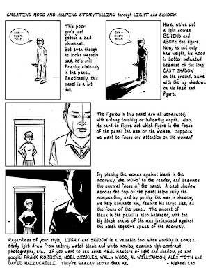
A problem that plagued me for years, and which still gives me some trouble, is knowing how to shade ink drawings. Where to put blacks, and why? The amazing , made this 3 page handout for his inking students explaining just that. I had been planning to cover some of this on Comic Tools, but there's no way I could have done this good a job. Here's a link to Cho's original post. Go and thank him for making this available to everybody.
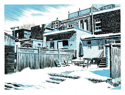
As long as I'm talking about Cho, I want you all to look at this sketch he did:

Makes you want to cry, right? Look How well-planned the blacks and whites are. Note how he hardly uses lines at all to describe forms, just light and texture. Look how unfussy yet neat his mark making on the brick is, how he changes it to fit the lighting. Look at the drybrushing he uses on the wooden fence and the overhang on the roof and in the clouds in the sky, how it gives the drawing softness and texture. This one sketch is like 30 Comic Tools entries rolled into one sublime expression of skill and control. And he calls it a "sketch." God damn you to hell Cho, you extraordinary son of a bitch.

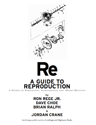
Here's something that every single cartoonist should have handy. Hell, they should have it memorized. It's a guide to photocopying, silkscreening, and offset printing by Ron Rege Jr., Dave Choe, Brian Ralph and Jordan Crane. You can download the PDF by going here: www.reddingk.com/img/reproguide.pdf. Whether you make minicomics or professionally printed books, no professional should be running around without knowing everything in this guide. Absolutely mandatory reading.

Another piece of mandatory reading is the infamous critique Alex Toth gave to Steve Rude. Rude sent the penciled pages of a Johnny Quest story to Toth, asking him what he thought. Toth let him know. Some see Toth's intense, brick-by-brick critique as being angry or hostile. Quite the contrary, Toth thought Rude a good artist, and respected Rude enough to take quite a lot of time to look at Rude's work very, very carefully. He saw Rude being lazy and taking shortcuts, and as Toth said right at the beginning, Rude was too good to be that bad. Toth's voice should be the internal monologue in our heads, pushing us out of laziness and into greatness, calling us on our bullshit, loving us. The last page of Toth's critique is the purest expression I've ever seen of exasperation at wasted potential. Toth wants to see the work he knows Rude CAN make, but doesn't. He is saying to Rude, GET UP. BE WHAT I KNOW YOU CAN BE. BE GREAT.

If you've ever wondered when you should bold text, or when to use a double dash versus an elipsis, or when to spell versus write out numbers in comics, then you should read this nifty guide to Comics Grammar and Tradition by Blambot's Nate Piekos. It answers all these questions and more, and contains tips from people such as master letterers Todd Klein and Clem Robins, and Dark Horse editor Scott Allie.
Josiah Leighton wrote a post recently the got linked to pretty heavily, wherein he went panel-by-panel and described exactly why Jeff Smith is an amazing fucking cartoonist. It's kind of like the Toth Crititque or Steve Rude except good. But what I wanted you all to see was his summarizing paragraph, which may be the most concise, correct guide for how to frame a shot I've ever heard:

The lesson here, as I believe Smith so eloquently demonstrates, is follow your gut when it comes to framing shots. Imagine you are in the situations you have cooked up for your characters, and think about what you’d be looking at. If you’ve just reached the top of that mountain, you’re not going to be checking your shoes for dirt. Take in that scene. Would you even notice the wallpaper when you’re dining with a woman that beautiful? Show your reader what you would see, and only what you would see, through your eyes. And don’t think twice about moving that camera.

If you're not reading Josiah's blog, you should be. It's a comics course for free. I've paid for classes at SVA that taught me way less than any one of these articles on action in comics.
Go and pillage his blog for everything it has to teach you.

For years I used photoshop without knowing about any of the key commands. My room mate Erika Moen eventually clued me in to them. Don't be embarrassingly ignorant like me. Here's a nifty little guide to photoshop key commands. They will make your life easier.

Craig Thompson linked to my interview with him, and when he did he posted a photo of this great thing he has on his brush to help with his hand pain.
Craig is often posting process sketches and before-after pages to show his process, and anyone who likes Comic Tools should peruse his old posts and add his blog to their reader.

That's all for this week! Come back next week when I talk about How to get the Perfect White Out Consistency.
This Week on Comic Tools: Lettering Nibs There was a period of a few years where I was really obsessed with achieving lettering like you see in old Sears and Robuck catalogues. One of the principal tools used to achieve solid block lettering was the lettering nib.


A lettering nib is a fixed-width (no flex) nib made for laying a lot of ink down in a specific shape. The tip of a lettering nib is a large shape of varying size that can be round or squared off, and when you draw with it you press the whole surface of the tip to the paper. Lettering nibs all have an extra piece of metal that fits over the nib to hold a huge bead of ink to feed the surface area of that enormous tip. Here's 3 different designs of ink resevoir, seen from the side:
Lettering nibs are VERY easy to use, and much more forgiving to draw with than a normal nib. Because of the wide, inflexible tip, you can move slowly and deliberately and not get a wobbly line like you would slowing down with a flexible nib. In fact, there's only one trick to drawing with a lettering nib:

To get really crisp, invisible seams on the corners of your letters, latch the shape of the tip up to the line, and then draw. Perfect corners every time.
If you get really good at this the lines look so clean they almost don't look like they were made by human hands. Or you can use the nib less carefully for lines that look neat yet have personality.


Make sure you always clean your lettering nibs after every use, because they can clog and lose function if you allow buildup. Make sure to wipe UNDERNEATH that extra piece of metal. Really get in there and floss the ink out.

My friend Hilary recently have me some lettering nibs with this fantastic latch design that lets the nib pop wide open for easy cleaning. You'd think this design would be flimsy, but it's actually quite tight and robust.


Nibs depicted in this post:

Ross F. George patent Speedball U.S.A. made by Hunt Pen Co., Size A-3 (Small square)
Ross F. George patent Speedball U.S.A. made by Hunt Pen Co., Size A-1 (Large square)
Resterbrook and Co. Drawlet pen, size No. 3 (small round)
Speedball Flicker U.S.A., George Patents, Hunt Pen Co., Size FB2 (large round w/flippy latch)

Next week on Comic Tools: Things you should read