Showing posts with label Matt Bernier. Show all posts

So, after several days of lettering, and as a result of the temporary financial (and therefore mental) security of having a job, I was able to dip into my head just far enough to start doing anatomy studies. I have several anatomy pieces in the works for Comic Tools, and one in particular is a lesson on the pelvis, so I doodled stuff for that. Nothing emotionally involved, so I was able to concentrate and draw.

After awhile of that, I started feeling secure enough to dip down slightly more and start working on the likenesses of characters in the story I'm working on with my friend Emily. I hadn't drawn in some time, so the results were crude, but my hand was loosening up. I still couldn't draw for very long without sinking into my head and being caught in the gravity of the unapproachable ball of sadness, but still, some work is more than no work.


Things went on like that for awhile and then around Christmas I started having an idea for a story set in the world of Emily's stories, so I bought a little notebook and starting taking down every little thought that came. The following two pages describe the premise of the story. While it does address my own breakup and my feelings about it, which in recent months I've been slowly able to approach, it also concerns friends and family members whose lives were altered forever by the effects of losing a lover. It's sort of a theme in my family, not ever fully recovering from these sorts of losses, and one I wanted to explore visually.
Lately I've found that the bakery near my work is a great place to get drawing done, and every time I have a late shift I arrive early and draw a page's worth of anything, and send it to Emily. My hand still keeps trying to make marks like I'm drawing Acorn, but slowly my hand is drawing more and more like it's supposed to for this story.


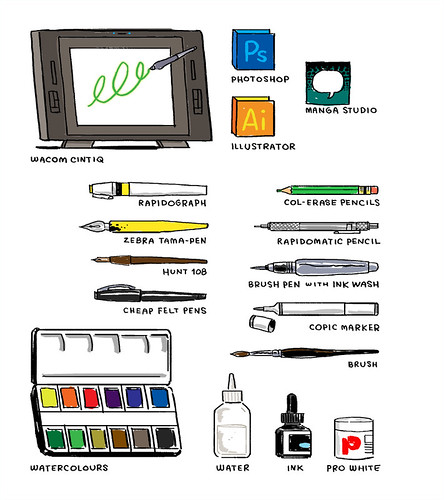
Comic Tools always follows close behind whatever I'm doing with my comics. I'll hit a problem, overcome it, and then write a tutorial. The anatomy entries were the product of my frustrations with the anatomical teaching materials available to me. And it will be like that with this project. As I go along, the things I teach will likely follow close behind the obstacles I overcome in making it. For now, my obstacle is making it through every day with less pain and more art, so that's what I'm posting about.
So, long term readers of this blog may recall this post on June 7th, 2010. What you might recall about it is that I didn't post a damned thing again until this post on December 12th, 2010. Then I posted some stuff for a bit and disappeared until this post, following which I've been posting regularly, if less energetically than in what might be referred to as the blog's "heyday."

Well, as you might suspect, it all ties into a time line of events you weren't privy to. To put it succinctly, I lost, in part through my own fault and in part through circumstance, three of the most important things to me in the world, in the space of a year. Failed at them and lost them, to be exact. And in each case I caused harm not only to myself but to the other parties involved. Financial, as well as emotional, in two cases. That first post came right after the first, and the second most painful. I needed a jolt of money to have time to do finish the next step in my work on Acorn, the book I was working on, and had been working on for four and a half years. And right then came a project from Patton Oswalt, who, as you've seen, I'd done some posters for. He wanted me to do a comic for his first book, Werewolves and Lollipops. I saw my chance, asked for as much money for it as I could, and being the always good patron of illustrators that he is, he paid me well for it, in advance. About a week and a half later I started suffering from what would become dual illnesses that had me literally bleeding out of my head and my ass at the same time, and that's not even slightly getting into the gross parts. I drew a fevered, unpublishable version of the comic, then drew another, spending so much energy on it I wrecked my recovery and went into remission, and had to finish it sick. It's in his book now. It was a month late, it's the worst thing I have ever drawn, and a man who is a hero to me, who was always nice to me, who gave me a chance, paid dearly out of his own pocket for that piece of shit.

And the worst part is it wasn't enough. I was so late with the project I had to get a job, and I couldn't continue on the book. I was demoralized, more ashamed than I have ever been, and still pretty physically crappy. That was when I made the first post.

The second post came awhile after I'd been kicked off a project I started off on as an ass kicking deadline hero, having not turned in any work to speak of for...many months. And there was certainly no sign I'd be able to for...years. It didn't hurt as much as the Patton thing, because at least I owed the publisher a shitload of money, and I never turned in bad work to them ever. That's how bad it was, that owing them $17,500 made me feel BETTER. But at least I still had my girlfriend, right? Well, you'll notice the posts stopped again.

And let me tell you, those are only the top three things out of a year that would have sucked without them. Psychopath boss at a job that made me miserable, landlord who didn't heat our apartment for the better part of 2 months, to the extent that it went repeatedly got down to the high thirties in our apartment, room mate drama, friends moving away... And this was all after the bitter failure and financial ruin of my move to Portland, which I still haven't gotten over, emotionally or financially.

It wasn't even just that I had nothing in the tank. Writing something, anything, involves settling down into your own head for a bit, and I absolutely could not be alone with my thoughts and emotions. The breakup was the last straw. I marvel at it- it wasn't even a bad breakup. It was about as good as could be hoped for. And I've been through a lot of tragedies and rough spots in my life. I've lost friends and family to untimely deaths, been attacked by gangs and hired thugs in school, helped drag my father's body off a couch so my mom could do CPR while I flagged down the ambulance and then had kids say to me "Ha ha, your dad died!"...All pretty bad stuff. And like I said, fairly good breakup. But I have never, ever been in that kind of pain, ever. It was, and continues to be, much worse than I anticipated. I still haven't cried about it. The rest of my life collapsed around me before the breakup, and until I set it back to at least stable, I'm like a paramedic, staying frosty and trying to contain myself until it's safe for me to react to how I feel about what's happened.

The inside of my head was a no fly zone for months, not even for a second, and that definitely meant no writing, no drawing. Hardly any thinking, really.

It's been almost a year now and you were the first to know when the logjam cleared enough for me to write. For several months now I've been able to feel joy, and I spend less and less time each day feeling terrible. I don't feel as good as I used to- the untouchable ball of sadness is still there, waiting for me to make things safe enough to come out, and it's presence dulls all my feelings. But things are better. And I am, at last, starting to work on comics again.

It's that process I'd like to talk about.

Before I could be in my head enough to post here again, I still wanted to make marks. I'm an artist before I'm anything else. Even rendered incapable of doing art, I have to make something with my hands. So the first thing I did was lettering. I knew my lettering hand would be rusty from disuse, so while I was working in the Shaker store this summer I wrote down all the lyrics from the Shaker songs, words from packages on the desk, whatever sentences came to mind. I filled pages with just solid text, trying to make it as even and perfect as I could. It wasn't art, but at least I could feel competence and confidence come back into my disused hands.


This post is getting pretty long, so I'm gonna continue it in another installment. Before I go, though, here's a video of Fabio Moon inking. Christ I love videos of cartoonists inking.
This week: Happy New Year!

First, two great posts about pricing your work from two talented illustrators, Koren Shadmi and Jessica Hische. How much should you ask for for a job? Bookmark these for wherever you'll have to ask that.

I participated in The Beat's annual year-end survey, and you can see my responses here.

This photo is hilarious:

JOKER

See you next week!
This week: Recommended animal anatomy video

You all should all already know about this week's topic, which I heard about on James Gurney's blog, because I've told you many a time about how great and useful James Gurney's blog is. I post things from it all the time, it's in the links sidebar, and any of you who aren't subscribed to it are fools shooting your artistic education in the foot.

So, being as you already read this post this morning when it popped up in your blog reader, I'll skip to saying that it intrigued me so much that I bought the video and found it to be worthwhile enough to recommend that you do the same.

Yes, I know, it's 39 bucks. Yes, that's a lot of money. Last year was the first year in three years I had to even file income taxes, having made an average of $8,000 a year after gross adjustment in those years, and this year I'm a clerk working for $9.75 an hour, so I don't wanna hear any clamouring about anyone else's budgetary constraints, especially not from anyone with a smartphone, or who buys coffee with any regularity. For 39 bucks you're getting more information than you'd get in three decent hour-long collage classes, from a very gifted professor, for way, way less money than you'd pay just for the lecture time, let alone the cost and time expense of putting together the graphics for the videos. These are worth the cash, if they suit your needs.

The videos do for basic animal anatomy what I endeavored to do for human anatomy in my anatomy posts (and will continue to do, several more coming at an undetermined time), but from someone much more expert and gifted than myself. His insights into simple but profound differences in quadruped and biped anatomy were revelations to me, in that way when you hear someone perfectly articulate a concept you've only barely understood by instinct. After watching these videos, I will look at animals and my approach to drawing them on a wholly different way.

I have a small issue with his basic shape exercises. I notice that he has a tendency, like many instructors, to assign beginner students different basic shapes for learning anatomy than they themselves use when drawing, which I feel hampers rather than enhances understanding of shape and ability to construct. However, he makes up for it by reversing the usually backasswards process I see in so many well regarded and in my opinion useless how to draw books by encouraging you to start with a gestural sketch, and use basic shapes to help you true the parts that seem off. Or, to use them as a separate intellectual exercise altogether. He's also very clear that you may use any basic shapes you like that help you understand your drawing better.

He's a gifted instructor, and it shows in his student's work, which is sprinkled all through the videos. You can tell he's taught them to really SEE differently. The music in the videos is ridiculous, but evidently it was composed by his son, so what can you do.

If you're someone who's ever had trouble drawing horses or realistic cats, which is everyone if we're not lying to ourselves, you really should invest in this tutorial.

Speaking of horses, I love these drawings from Fabio Moon showing the thumbnail drawing for a panel and the final artwork. This is what it means to take an adequate composition and push it into a good one.

Mark Kennedy posted this great analysis of how one out-of-place element in your art can throw your entire reality out of whack. Seriously, what was the artist thinking with those damned stars?

Finally, Kate Beaton did some great holiday comics. Yes, I know it's redundant to day she did some great anything.

See you next week!
This week: Your hand doesn't bend here.

So, it came up several times this last week with several coworkers, who in my case are artists, that they didn't realize the bones in your hand don't bend in the location illustrated in the title. I can sort of see why someone might think it, so I'm just gonna toss this out there for people. In fact, your bones don't bend at either that line, nor the line seperating the palm from the fingers. The pad at the top of your palm actually comes both a little above and a little below your knuckles. Your knuckles are roughly in the middle of the pad, as you can see in the illustration:

So when you bend your fingers down, the pad, which makes the bones in your palm appear longer than they are, gets bent down. This makes the palm seem to shorten and makes it look like the palm bones themselves must be bending. The phonomenon is easier to understand from the side:

If you really want to prove it to yourself, fold your hand while looking at the back. You will see that the back does not change in length at all.

Knowing that the pad comes above and below the knuckles also helps you draw palm lines more accurately. I can't tell you how many students I've seen draw a hand with the top fold line in line with the knuckles, who then try to fit the lines of the palm onto a palm that's too small to fit them into. It's especially a problem for young artists who draw "realistically", meaning they hatch and shade too much and observe too little. It is a problem 100% of the time for those guys who seem to know how to draw every single gun known to man, in perspective, but can't draw a back three quarter view of a head or a garment that hangs naturally to save their lives. Those of you who have been to art school know the ones I mean.

Oh, and check out this recipe comic from Laura Park! Isn't she the best? That's a rhetorical question, obviously she is, duh.

See you next week!
This week: Assorted Tips

Cleaning out nifty links I've been saving:

If you don't read Brandon Graham's blog you should. He has fantastic taste and insightful comments about comics. I was particularly struck by this bit in one of his posts:

For some reason BPRD feels to me like watching a good tv series. It might be the episodic breakdown of the thing and the multiple writers. One thing I noticed is Guy Davis panels almost read like tv.

"I thought this scene where this old woman is talking through a child was done how you would see it on tv. --with the woman starting to say the words and the little girl finishing them--seperate panels seperate baloons. I photoshoped, on the right what i'd look like if both characters spoke through the same baloon, with 2 tails.
(click image to make it bigger)

I like how a small tweak like that can effect how it reads.
I think the original lettering does make the old woman and the girl seem farther away."

Chris Schweizer is always posting some awesome shit on his blog. Here's a fantastic (illustrated!) post on avoiding tangents of all sorts.

And here is a short but useful post on how clothes drape from the always educational Gurney Journey blog.

Illustrator, cartoonist, and teacher Jillian Tamaki made a student FAQ page for her website. It's great! Go read it!

After Completing Habibi, Craig Thompson is now working on three books at once. That all ages one looks absolutely delicious.

And finally, Kate Beaton's Hark, a Vagrant! collection made it into Time's best 10 books of the year!

Have a good week all!
Potpourri

No specific topic this week, but rather a smattering of fascinating things. I'm gonna kick it off Elanor Davis and the interesting method she used to generate this image:
Elanor uses guache to make color paintings a lot, so I thought nothing of seeing a two-tone drawing from her, until I saw a series of tweets from her, which she meant to send to meg Hunt, but mistakenly posted to all, saying that she'd actually just altered an ink wash drawing to make this and other illustrations. I was fascinated, and asked if she'd elaborate, which of course she did:

Hey Matt!

Ha! you caught those tweets - I meant them to be @meg and mis-sent them, then threw my hands up at the whole thing. : )

Yep, that's a greyscale piece I messed w/ in photoshop. I don't have a good method for going about this process, there surely is an easier way to do it. I basically just do it for limited color printing processes; I don't think I would do it for any other reason, it's a hassle! : p

Make two separate files. Keep one greyscale.

for the other one: Image > mode >duotone

choose monotone; choose red (or whatever)

Now turn it into CMYK. Copy paste the greyscale file on top of the red version. They should line up perfectly. Then erase whatever parts of the grey layer you want to be red.

You can also monotone both w/ different colors. This image is 2 colors, for a process where the 2 colors combine into a 3rd. Just make the top layer transparent.

Finally, select the erased sections of the grey layer, inverse the selection, and delete that part from the red layer.

Thanks for asking! I hope you're doing great! : )

Eleanor
Isn't she great? Feel free to thank her by buying all her work.

Next up is a review of a device I hadn't even heard about until this review, the Wacom Inkling:


It sounds neat, but I was disappointed to see that the scanner gets less accurate the farther away from it you get, so you have to use a fairly small drawing area. So, no good for full-size pages, but maybe good for scaled down thumbnails. I'd probably just get a pad myself, but Crabfu makes the point that this now gives him original art to sell while simultaneously creating a layered, colorable digital file. Original art sells for more than prints, and that means more income, so it's not a trivial consideration. The alterations you can make to the line quality after the fact is pretty interesting too.

John Martz did a drawing of all the stuff he used to draw, for the artist's space porn tumblr Where They Draw. I don't know just why, but I LOVE seeing people's studio setups.

The Tools I Use

Alec Longstreth finally finished the final chapter of Basewood! As some of you may know, Alec resolved not to shave or cut his hair until this task was completed. Well, here's what he looks like now:

Chapter 5: Inked Page 52 - 100% DONE!!!

As you can see in his post about it, he'll be cutting his hair at the release party. Alec has been a friend of mine as well as Comic Tools blog, and is himself a great comics teacher, so I'd have posted about this no matter what, But as it happens, Alec gave me a flimsy premise to call this a tool related post with this comment to his post:

Yes, I will be donating my hair. That would be funny to make a brush from the beard hair - maybe it would have magical comics power in it! :P
Finally, nd totally unjustifiably, mega-super friend of Comic Tools Blog Hope Larson is making crazy-ass ice creams and posting photos of them: Ice Cream Log

See you next week!
This week on Comic Tools: Oblique Nib Holders
James Gurney did most of my work for me this week posting about oblique nib holders. (He says pen holder, I say nib holder.) It's the tool to use if you want to draw lots of slanty lettering without ruining your hands. He even carved his own out of wood so it's fit his hand better:

It turns out, a company named Yoropen makes oblique ballpoint pens and pencils:

According to testimonials on the site, oblique pens and pencils have distinct advantages for many people. In the case of left-handed people, they allow the writer to see their work, and to not have to hook their hand over awkwardly as they write. They're said to promote a more correct grip in small children learning to write, and aid in letter formation. Their ease in grip is also said to be helpful to people with weakness in their hands, such as stroke victims, and people who suffer from writing strain. I'd like to get ahold of one sometime to try it out. I'd also be curious if an oblique nib holder helped left-handed cartoonists ink better. Anyone out there tried it?

They also make oblique nibs (also called elbow nibs) that fit in a regular nib holder. They look like this:

And now for some extras:

One of my favorite things on the internet is Vera Brosgol and Emily Carroll's series of drawings called Fashion From Old People. This blog is a fantastic resource to see how to really dress characters in clothing. They take a real dress from a photo, and then fit that dress to a cartoon character. I save every other drawing to my morgue (That's an old-fashioned illustrator's term for an illustrator's personal catalogue of reference and inspirational images) because I have trouble drawing overly generic clothing on characters, and seeing the different body shapes and types Vera and Emily fit the dresses to, and how the woman and the dress change one another, is always an inspiration to me.


Another one of my favorite things on the internet is when cartoonists post video of themselves working. Well, here's two great tastes that go great together: Vera drawing one of her FFOP posts. There's a LOT of great process stuff here, especially for people who draw all or partially digitally.

How ballsy is Schweizer's inking in this panel:
See you next week!
This Week: Escoda Brushes
So, many of you will remember the post where I retracted my endorsement of Rosemary's brushes, after several readers who had purchased from her reported a precipitous drop in quality to the point of being unusable. You're better off buying the cheapest nylon brush rather than a bad sable brush, and with Japan making those insanely resilient and sharp pocket brush pens, a sable brush had better be good for the money you pay.

In that same post I actually did review an Escoda brush, which I'd totally forgotten about. I got it on my trip to SCAD Atlanta, liked it okay, and suggested it for people as a possible alternative if Raphael brushes weren't available. I haven't drawn with brushes for awhile, so I totally forgot about it.

My current workplace sells Escoda brushes, and they're specifically mentioned in our training video on brushes. The owner, Larry, who travels all over the world to meet his suppliers and see their factories, talked in the video about what makes a brush good and why some good brush companies have lost their way *cough Windsor and newton cough*. Basically, what it comes down to is time spent in a single location. Brush making takes years, even decades to learn, and making the kolinsky sable brushes is the hardest, requiring workers who've been brush makers for 20 years or more. If a brush company moves it's facilities, (W&N), and the brush makers don't or can't follow, their experience is lost, and therefore the quality. You do still see, every so often, a decent W&N brush, but the rarity of them leads me to conjecture it may be as little as one person making those elusive few. I imagine an old man, surrounded by fumbling whipper-snappers, weeping to himself as he places each of his perfect brushes on a conveyor belt alongside their splaying messes of expensive hair.

Larry chose Escoda because their factory has been in the same place since 1949, 18 years longer than Raphael, which seems to make some of the consistently better sable brushes these days. I tested 3 of the brushes in our store to decide what size I wanted to buy to test for Comic Tools, and all of them came to a sharp, single hair point. THAT was encouraging- I wanted this company to be consistent, not just good, if I was to recommend them to my readers. I selected a size 4 to test.
I love it. It's better than Rosemary's best brushes ever were. It has great snap, which I prefer to the well-formed, but to my hand mushy-feeling Raphael brushes. (I don't want to seem like I don't like Raphael brushes, By the way. Habibi was drawn with one for chrissake. I just don't prefer the feel of them.) I compared it to my trusty W&N #3 brush, and in doing so a sense memory came back to me. It doesn't feel like my W&N brush does now (which I still prefer), but it does feel like what my W&N felt like new. I could feel the Escoda pushing my hand into making the sorts of movements that led to my inking style when I drew my first book with my then brand-new W&N. How's the tip? That's a hair from my head next to those lines: Can it do drybrushing well? Yup:
Wispy lines? Uh huh:
Fiddly things like eyes and faces? Yes, and well: I look forward to using this brush and seeing how it ages. Now, there's another lovely characteristic to Escoda brushes, probably having to do with being made in Spain as opposed to Britain or France: They're relatively inexpensive. My W&N #3 cost me around $30 new. My Escoda #4? $16.40. No, really, go see. If you buy some from Artist and Craftsman, put a note in your order that Comic Tools Blog sent you, I'm sure it wouldn't hurt my standing with the company. I should tell you, however, that Blick has a better price. Buying from your local art store, if possible, is always best, especially since you can test the brushes, but if not, I feel obliged to ask that you consider Artist and Craftsman, a Maine-based and very fine art supply company, for your Kolinsky needs.

On another topic, it seems Amalgamated Biscuit has started something. Now Comic Tools reader Kat has made this adorable Totoro ink well as a more stable platform to resist upset by cat:

You can see more photos in her post about it. This is the inkwell I've been using, given to me by a friend:


(Remember, never dip your brush more than halfway if you can help it, and rinse it immediately if you do.)

See you next week!
Home made inkwell

Comic Tools reader Amalgamated Biscuit just showed me this terrific inkwell he made:

From his post:

"When my ink runs low I have to fish around at an angle to get enough ink on my nib and I usually end up covering my pen and hands. So I created this inkwell which is just deep and wide enough for my biggest nibs."


Too cool, right? Though I feel it's seriously lacking in a pair of googly eyes. The bottom in-action photo is slightly obscene, which I also feel googly eyes would help. Not help make it less obscene, mind you, just more hilarious.

Thanks to Amalgamated Biscuit for sharing!

Best nib holder I've seen:

Tachikawa Comic Pen Nib Holder - Model 36 - White Grip


No surprise it's from Japan, where drawing with ink tools is still so large an industry that nibs and other inking tools are still made with quality. I have several friends who've switched to this and they just love it. One really cool thing is it accepts crowquil/mapping nibs, which have round, circular bodies like this:
as well as regular nibs, which are concave troughs of metal like this:
Most nib holders can only accept one or the other, and the holders for mapping nibs tend to be thin, exacerbating strain during fine work when using a tool used almost exclusively for fine work. The Tachikawa's thick body reduces wrist strain, and the rubber grip makes it easy to hold. Nibs sit securely in it, but the plastic isn't as rigid as on a Speedball holder, so you don't have to jam nibs in or strain to pry them out again.

Jetpens.com also has a fantastic selection of Japanese cartooning nibs, the best money can buy, unless you go antique hunting. (Fun fact about the two brands of Manga "G" nib: they're literally made across the street from one another. Both factories buy the same steel, mill it on the same machines, and put different brand stamps on them. They're otherwise identical, sort of like Olfa and NT blades, also made in Japan in neighboring factories using practically identical methods. NT's cutters are way better, though.) They also stock the sometimes hard to find Pentel Pocket brush refills at a not-bad-not-amazing price, and sell the brushpen itself at a pretty amazing price.

The Tachikawa is well worth the six bucks, being comfortable and well made, and would be the only nib holder you ever had to buy in your life.
This week's title is a video:

Start at 6:32


Wow, I still have 237 followers? Why? Did you all forget to unsubscribe? Well, either your loyalty or your laziness are to be rewarded, because I'm starting again.

It's funny, you know what the impetus was, the thing that finally broke the intertia? I'm working at an art store now, and some old man came in having had trouble with his nibs, which he is new to using. I was explaining to him what he was doing wrong and how to fix it, and then driving home that night it hit me: I can't really deal with giving advice to strangers who walk in the door, and not my Comic Tools readers, who have truly done for me in the past. And besides, my broken life is finally back together enough that I feel like I can bust out a column about something regularly.

So, Hi! Surprise! And let me start my being back with the advice I have this old man: keep your nib clean while you work, always move it towards the concave belly, and always clean it when you're finished.

And Happy Birthday, Rivkah!

Gerhard. Gare-hard? Jer-ard?

Sean Michael Robinson at The Comics Journal did an exhaustive interview with Gerhard, Dave Sim's background artist on Cerebus. It's a must read for every cartoonist who cares about technique, as the Robinson asks Gerhard about specific pages throughout the comic's decades-long run, with Gerhard talking about everything from his preference to toothbrushes over airbrushes for snow effects to showing photos of the models he built ho help him draw rows of houses on slanted streets.

Gerhard with his models.

Gerhard is one of the best draftsman in the last 50 years of comics, and this interview is one of the richest resources I've ever had a chance to bring to your attention. Read, and watch as a man grows from a talented amateur into a true virtuoso, sharing his secrets with us.

A floor plan to a room in Cerebus.

Jesus, I love how loose Guy Davis' pencils are. I always learn something about keeping freedom in my inking looking at them.

Oh, by the way, I'm selling some clothes on Ebay, if anyone's interested:

Rare Red Swiss Army coat
Green double-breasted jacket
Tailored brown suit
This week on Comic Tools: Futzing with nibs

I'm insomniac tonight, so I'll type this sucker up now:

A few weeks ago MK (Remember MK? Started this blog? Wrote the fantastic comic Americus, illustrated by Jonathan Hill, to be published by First Second later this year, which you can now read in webcomic form? That MK.) wrote me with this:

"Hey Matt. So possibly right under your feet all day at work are these scroll nibs, which are usually used for making filials and jazz for fancy calligraphy. Also, at the very bottom, is a thing called a music nib, used for making musical notation lines, it is made by Brause, not Mitchell, so it won't be in the kit. I got mine from scribblers in the UK after seeing them in someone else's catalogue, and I assumed they must be hackable for cartooning short cuts. Double vision, quicker hatching for bgs that must be covered in them, plaid shirts, checkerboards... the list is not gigantic, but you can get some interesting results. I'm not entirely certain that they are in NY Central, but I believe I saw mitchell caligraphy kits hanging over the doorway to the little room the G nibs are stored in, so if you see them, you could probably come up with some ingenious use for them that I am missing. I've used them for a bit of grass in the new comic already, and it was delightful to use something a little different."

She included this photo:


Indeed we do have these nibs downstairs at New York Central. If you walk straight into the store about halfway, you'll see these cheesy looking beige cardboard bubble packets sitting way up high where the managers sit:


You'll have to ask for someone to help you reach them, unless you're seven feet tall. These are what the packets look like up close, and what they cost:

New York Central got the whole lot of them in a buyout of another closing supplier, so once these are gone, they're gone. Fortunately, for anyone who might want them, they don't seem to sell well. Anyhow I've got them back at home now, and I've been playing around with them. I've narrowed it down to 8 that produce various effects I like, and I've been futzing around with them, like MK did.

My first impressions are that either these types of nib are either all made of unusually crappy and thin steel, or that the tinyness of the individual nibs having to share the space makes them weak, much like too many babies sharing a womb, or that this particular brand may just be crappy. I don't know, but nonetheless I've found some uses for these that might induce me to buy more anyway.

The nibs with evenly spaced, equal-sized points make hatching large areas really, really easy and SOOOOOOO much faster. They also make great speed lines.

The evenly spaced nibs with one point larger than the other make pleasantly dynamic and perfectly spaced pipes, dowels, poles, and rope. If I wanted to to an entire series of knot-tying illustrations, one of these nibs would very possibly save me from insanity.

The nibs with multiple slits cut going to the same point hold extra ink like a lettering nib while remaining flexible like a quill, and so far the best use I've found for these are really fantastic willowy tree limbs that you can draw with the line variation of a brush, but with a line quality that is unmistakably of a nib.


Anyhow, I'm gonna mess around with these some more and then do a proper post on them.

Finally a link: A fantastic interview with Mike Mignola about setting and architecture. One lesson learned: you neither need to like drawing, nor even actually draw, straight lines or perfect perspective in order to draw houses, cities, and other settings in a convincing and lively way. Slanty lines and age are your friends.

See you next week!