This week: Recommended animal anatomy video
You all should all already know about this week's topic, which I heard about on James Gurney's blog, because I've told you many a time about how great and useful James Gurney's blog is. I post things from it all the time, it's in the links sidebar, and any of you who aren't subscribed to it are fools shooting your artistic education in the foot.
So, being as you already read this post this morning when it popped up in your blog reader, I'll skip to saying that it intrigued me so much that I bought the video and found it to be worthwhile enough to recommend that you do the same.
Yes, I know, it's 39 bucks. Yes, that's a lot of money. Last year was the first year in three years I had to even file income taxes, having made an average of $8,000 a year after gross adjustment in those years, and this year I'm a clerk working for $9.75 an hour, so I don't wanna hear any clamouring about anyone else's budgetary constraints, especially not from anyone with a smartphone, or who buys coffee with any regularity. For 39 bucks you're getting more information than you'd get in three decent hour-long collage classes, from a very gifted professor, for way, way less money than you'd pay just for the lecture time, let alone the cost and time expense of putting together the graphics for the videos. These are worth the cash, if they suit your needs.
The videos do for basic animal anatomy what I endeavored to do for human anatomy in my anatomy posts (and will continue to do, several more coming at an undetermined time), but from someone much more expert and gifted than myself. His insights into simple but profound differences in quadruped and biped anatomy were revelations to me, in that way when you hear someone perfectly articulate a concept you've only barely understood by instinct. After watching these videos, I will look at animals and my approach to drawing them on a wholly different way.
I have a small issue with his basic shape exercises. I notice that he has a tendency, like many instructors, to assign beginner students different basic shapes for learning anatomy than they themselves use when drawing, which I feel hampers rather than enhances understanding of shape and ability to construct. However, he makes up for it by reversing the usually backasswards process I see in so many well regarded and in my opinion useless how to draw books by encouraging you to start with a gestural sketch, and use basic shapes to help you true the parts that seem off. Or, to use them as a separate intellectual exercise altogether. He's also very clear that you may use any basic shapes you like that help you understand your drawing better.
He's a gifted instructor, and it shows in his student's work, which is sprinkled all through the videos. You can tell he's taught them to really SEE differently. The music in the videos is ridiculous, but evidently it was composed by his son, so what can you do.
If you're someone who's ever had trouble drawing horses or realistic cats, which is everyone if we're not lying to ourselves, you really should invest in this tutorial.
Speaking of horses, I love these drawings from Fabio Moon showing the thumbnail drawing for a panel and the final artwork. This is what it means to take an adequate composition and push it into a good one.
Mark Kennedy posted this great analysis of how one out-of-place element in your art can throw your entire reality out of whack. Seriously, what was the artist thinking with those damned stars?
Finally, Kate Beaton did some great holiday comics. Yes, I know it's redundant to day she did some great anything.
See you next week!
Showing posts with label anatomy. Show all posts
Showing posts with label anatomy. Show all posts
This week: Your hand doesn't bend here.
 So, it came up several times this last week with several coworkers, who in my case are artists, that they didn't realize the bones in your hand don't bend in the location illustrated in the title. I can sort of see why someone might think it, so I'm just gonna toss this out there for people. In fact, your bones don't bend at either that line, nor the line seperating the palm from the fingers. The pad at the top of your palm actually comes both a little above and a little below your knuckles. Your knuckles are roughly in the middle of the pad, as you can see in the illustration:
 So when you bend your fingers down, the pad, which makes the bones in your palm appear longer than they are, gets bent down. This makes the palm seem to shorten and makes it look like the palm bones themselves must be bending. The phonomenon is easier to understand from the side:
 If you really want to prove it to yourself, fold your hand while looking at the back. You will see that the back does not change in length at all.
Knowing that the pad comes above and below the knuckles also helps you draw palm lines more accurately. I can't tell you how many students I've seen draw a hand with the top fold line in line with the knuckles, who then try to fit the lines of the palm onto a palm that's too small to fit them into. It's especially a problem for young artists who draw "realistically", meaning they hatch and shade too much and observe too little. It is a problem 100% of the time for those guys who seem to know how to draw every single gun known to man, in perspective, but can't draw a back three quarter view of a head or a garment that hangs naturally to save their lives. Those of you who have been to art school know the ones I mean.
Oh, and check out this recipe comic from Laura Park! Isn't she the best? That's a rhetorical question, obviously she is, duh.
See you next week!
This week on Comic Tools: Preparation Links
Sarah Glidden shows us how she made her wonderful watercolor comic pages. Of particular interest to me was her use of a glaze of color under SOME, but not ALL parts of the images. I've seen cartoonists like Lucy Knisley use washes of color, usually yellow, over the whole image, but the way Sarah uses it is interesting, because she uses it to compartmentalize different parts of the ground from each other.
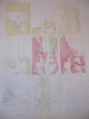 On this example page, she uses a yellow wash to separate the foreground from the midground and background, and blue to make a background sink deeper into shadow. You can't always see these glazes of undercolor in the final panels, yet this subtle technique makes her painted panels organized and easier to read.
Friend of Comic Tools, Jason Little, wrote this fantastic post about his artwork and writing process leading up to his fantastic latest book from Dark Horse, Motel Art Improvement Service. There's so much to love about this post, like his accounting about how the story started as a misguided diatribe about the health insurance industry, or how he originally wanted to serialize the story in a series of regular comic books. He was talked out of both ideas, and the result is better for it. It's the comics equivalent of a wife saying to her husband, "You're not going out looking like THAT, are you?!"
I must say though, I love this panel from when he was contemplating doing the book in only two colors of ink to save printing costs. It shows what a master of print Jason is, that if you don't have an eye that looks for such things, you don't immediately notice this panel has only two colors. It looks so lush.

Aaron Renier talks about his process writing and drawing Walker Bean in this Newsarama interview. I have seen art from this book, and it makes me shake with jealousy just thinking about it, it's so good.
Friend of Comic Tools Chris Schweizer posts artwork frequently to his blog, and it reveals that he one one of the ballsiest inkers and loosest pencillers I have ever seen in my life. Seriously, his pencils are often less resolved that a game of connect the dots. I don't know how he does it. Here, he posts one of his most detailed penciled panels (still absurdly under rendered), and here he shows off some gorgeous setting sketches for a story. The amazing thing is, that panel isn't even his finished inks- for his comics,he renders what look like finished inks in marker, then scans them in, prints them in blue, and inks in brush over that. But I've seen him ink drawings straight from pencils that loose that looked no less finished, to my eye. Insane.
Here we have a great example of everything I stand against in art teaching, in this excerpt from How to Draw Comics the Marvel Way:
See how easy it is? Just draw a stick figure, then add cylinders, then fill it in with years of painstaking anatomical study and direct life drawing knowledge, not to mention expert knowledge of lighting, drapery, and character design. Jesus Christ, why don't they just show you a white sheet of paper and say "Just add characters here with a pencil! Pause the tape while you practice doing that."
My thanks to my good friend Emily Felger for sending me a new keyboard.
Sarah Glidden shows us how she made her wonderful watercolor comic pages. Of particular interest to me was her use of a glaze of color under SOME, but not ALL parts of the images. I've seen cartoonists like Lucy Knisley use washes of color, usually yellow, over the whole image, but the way Sarah uses it is interesting, because she uses it to compartmentalize different parts of the ground from each other.
On this example page, she uses a yellow wash to separate the foreground from the midground and background, and blue to make a background sink deeper into shadow. You can't always see these glazes of undercolor in the final panels, yet this subtle technique makes her painted panels organized and easier to read.Friend of Comic Tools, Jason Little, wrote this fantastic post about his artwork and writing process leading up to his fantastic latest book from Dark Horse, Motel Art Improvement Service. There's so much to love about this post, like his accounting about how the story started as a misguided diatribe about the health insurance industry, or how he originally wanted to serialize the story in a series of regular comic books. He was talked out of both ideas, and the result is better for it. It's the comics equivalent of a wife saying to her husband, "You're not going out looking like THAT, are you?!"
I must say though, I love this panel from when he was contemplating doing the book in only two colors of ink to save printing costs. It shows what a master of print Jason is, that if you don't have an eye that looks for such things, you don't immediately notice this panel has only two colors. It looks so lush.

Aaron Renier talks about his process writing and drawing Walker Bean in this Newsarama interview. I have seen art from this book, and it makes me shake with jealousy just thinking about it, it's so good.
Friend of Comic Tools Chris Schweizer posts artwork frequently to his blog, and it reveals that he one one of the ballsiest inkers and loosest pencillers I have ever seen in my life. Seriously, his pencils are often less resolved that a game of connect the dots. I don't know how he does it. Here, he posts one of his most detailed penciled panels (still absurdly under rendered), and here he shows off some gorgeous setting sketches for a story. The amazing thing is, that panel isn't even his finished inks- for his comics,he renders what look like finished inks in marker, then scans them in, prints them in blue, and inks in brush over that. But I've seen him ink drawings straight from pencils that loose that looked no less finished, to my eye. Insane.
Here we have a great example of everything I stand against in art teaching, in this excerpt from How to Draw Comics the Marvel Way:
See how easy it is? Just draw a stick figure, then add cylinders, then fill it in with years of painstaking anatomical study and direct life drawing knowledge, not to mention expert knowledge of lighting, drapery, and character design. Jesus Christ, why don't they just show you a white sheet of paper and say "Just add characters here with a pencil! Pause the tape while you practice doing that."
My thanks to my good friend Emily Felger for sending me a new keyboard.
 This week: Neck Muscles (and also hand resources)
 It's not hard to see why the neck freaks so many people out. You look at it with the skin on and it's hard to see what's going on. Then you look at an anatomy diagram and you see what looks like dozens of tiny muscles in layers crisscrossing every which way, and you like eating the end of a shotgun.
The problem with looking at an anatomy text to see what's going on with the neck is that anatomy texts are there to each you anatomy, but they aren't prioritized for the artist, who more than likely just wants to know what muscle they're looking at, or trying to get those slanty lines in the neck right.
To actually draw a neck, any neck, you only need to know five muscles.
You heard me. Five. (Technically nine, but the first four are symmetrical, and if you can draw them on one side you can draw them on the other, just like if you can draw a left arm you can draw a right arm.)
If you're drawing more than five visible neck muscles, you're not drawing a human being. Seriously. ("But Matt, what about when I flex my neck and make all those muscles pop out? There's more than five of those!" No there actually aren't, but I'll explain later why it looks like there is.)
Five muscles. Here we go:
First, here's our plain skeleton. You'll note he has ears, and dots behind his ears (not on the jawbone, but in this drawing the jawbone covers up where they'd actually be.) Those are there to show where some of the muscles insert.
 That tube in back of the muscles in the picture below is your windpipe. The cartilage of the trachea is larger and sticks out more in men than in women, although there are freakish examples like Ann Coulter. (No matter what I say, I cannot convince my mother that she actually is, and has always been, a biological woman.)
First two muscles: Sternohyoid comes up from the sternum and inserts in front of the trachea. Omohyoid comes from the bend 2/3rds out on the collar bone, attaches to the top rib, and then comes up and attaches in front of the trachea. These muscles are often mostly invisible, but they become prominent in very skinny people or in times of stress, anger, and fear.
 3rd and 4th muscles: you all recognise trapezius, right? Trapezius covers up a looooooooooot of muscles underneath it, making them pretty much invisible and making this lesson much shorter. Also, see how there's not really anything in front of either side of it? That gap that's left is actually a prominent feature of the neck and shoulder area, and you can actually see it in all the photos below that accompany the illustrations. The muscle that has two forks coming up from the sternumm and collar bone and reaching up behind the ear is sternocleidomastoid (say that 3 times fast), the most prominent and most often mis-drawn muscle when people draw necks. A lot of folks draw a slanty line in the neck not knowing where it comes from or where it's going to.
 Here's a good picture of the sternocleidomastoids from the side:
Here's what they all look like layered together.
 In this fetching photo of my friend Hilary Florido, you can see all of these muscles clearly. Look closely and you can actually see where her omohyoid muscle bends into her top rib:
  Looks like Trixie from Speed Racer, doesn't she?
The fifth and last muscles you need to know to draw the neck is platysma, a thin muscle that makes up the front of your neck. It's the muscle that sticks out and makes all those strainy lines when you try to make your "neck muscles" pop out. What looks like a lot of muscles is actually just the fibers of this one muscle.
Try not to overuse this one superhero artists, okay? Pay attention and you'll notice that even if you're straining or yelling you don't flex this muscle very often at all. Only in certain kinds of grimaces and yells.
 Here's someone flexing their platysma:
  Also for the superhero folk, note that platysma lays on either side of the trachia but not actually over it, and that it DOES NOT CIRCLE ALL THE WAY AROUND THE NECK, no matter what Rob Liefeld says. See how it only goes back so far? Yeah, keep that in mind, will you, superhero artists drawing necks?
You'd think that the neck muscles would stick out more in musclebound folk, but the opposite is actually the case: skinny people tend to have strand-like, very clear neck muscles whereas bulk tens to obscure them, as in this example:
 Looks like he's hiding a pineapple in there, doesn't he?
Okay, now, in the comments section a reader was begging me for a hand tutorial.
But there's no point in me doing one, because MAD cartoonist Tom Richmond already did a tutorial on hands that's better than the one I might have done by like a million billion times.
Tom has several other really intensive tutorials on his site, which can all be found at this link: http://www.tomrichmond.com/blog/tag/tutorial/ I'm gonna make that link a part of this blog's sidebar, too, it's such a great resource.
This is the last of my entries on anatomy for cartoonists, and I leave you with some hands drawn by Farel Darymple, who draws some of my favorite hands of anybody, ever: (click on them to read the comic they're from)


Next week: I'll actually be away at a funeral, but I have something up my sleeve that I've been saving for a rainy day.
 This week: Leg Muscles
If for this week's post about the legs I had done nothing but write "The femurs tilt in.", I'd have still improved the figure drawing of many people reading this immeasurably. Drawing the legs as two straight lines coming down from the torso has led to more frustration than just about anything except maybe feet and hands for just about every cartoonist. Drawing the legs straight when you stick-figure in your figure works for standing poses okay, assuming your figure is really cartoony or is wearing pants. But when you try to make that figure run, or get into an odd pose, things get pretty hairy and you start doing that re-draw-it-20-times-and-it-still-looks-funny thing. God help you if you tried drawing realistic muscles on a figure using straight legs as the basic shapes. It looks lumpy and wrong and you sink into confusion, frustration, drinking and suicide.
This week, I'll show you what's going on inside the legs, and what gives them that weird effect where they seem to form a straight line and yet aren't straight at all.
 Let's start with the bones. Here's the pelvis we learned how to draw, remember? Now, pick where your knees are gonna go for your character. in a stock-straight standing position they'll be under those loops of bone at the bottom of the pelvis called the ischiums. The knees are pretty thick, so draw something thick where the end of the knee bone's gonna be. In this position the feet will come below those, so mark them off. These 3 points, the ischiums, the knees, and the feet, form the "straight" line of the leg, and are what make all the crazy curves the leg takes seem straight while being very obviously curved. The leg does NOT form a straight line from the hip joints, like you might think.
 Now, to get the angle of the femur, draw your dots representing the greater trochanters, which is where your femur stops going slant-ways out from the joint and heads down. (draw them somewhere wider than the pelvis is wide and somewhere in the neighborhood of the ischiums in height.) Then draw a line from there to the INSIDE of the knee. Now you have your slant.
 Now draw slightly bowed-out lines from the inside of the knee down to the foot dots. These are actually too curved, I'm exaggerating a bit for effect. (although I like to curve them when drawing a figure because it makes the shape of the lower leg easier to draw)
 Now that's all you really need if you're just using these as guidelines for your figure drawing, but if you want to make bones, add the crested caps to the bend in the femurs (important for muscle attachment) and fill in the tibia at he knee joint. It should be about as wide as the corresponding part of the femur above.
 Now fill in the fibulas under the overhang of the tibias, and fill out the femurs, and change your dots into heel bones. Now you have bones!
 Now, the curves the bones take can seem pretty crazy, and it's hard to see how they come out to looking like a straight leg. When you draw a leg wrong with straight bones and then try to add muscles the muscles bulge out horribly. But when you draw muscles into the spaces of the crooked looking leg bones of a real skeleton they even everything out and make it appear straight and natural.
First, we start with the bones: (click on these to see them larger)
 Deep in your legs, coming from the ischiums, is a sort of fan of muscles that attaches up the entire inside length of the femur. (There are a LOT more than this, but unless you're drawing very realistic groins you only need to know these as a packet of muscles to get the shape of the leg right.) It's amazing how much more leg-like the skeleton gets just adding these isn't it?
 The next layer of muscles:
Front- Vastus lateralis on the outside and vastus medialis on the inside are the two quad muscles that make muscle men's legs seem creepy and lumpy above the knee. Nomuscles pass through the knee, only tendons of muscles, and so muscle bulges around the joint while the joint stays looking pretty much the same. They attach on the greater trochanter.
Back- Semi Tendinosus on the inside and Biceps femoris on the outside form the two muscles whose tendons shape the back of your knee and the back of the thigh. See how just with them there it looks like an almost complete knee joint? There you go. They originate from the ischiums, pass as tendon over the the back sides of the knee and then insert below the joint. These muscles act like the bicep muscle in your arm, bending the knee. It even has two parts just like the biceps. Hmm.
 Next layer:
Front- Completing the quad muscles and the front of the thigh muscles are rectus femoris and satorius. They both come from the crest of the pelvis. Rectus femoris keeps the other two quad muscles visually separate and turns into the huge tendon that houses your patella (knee cap) and goes down over the front of the knee joint, basically defining the shape of the entire front of the knee joint. Satorius curves around the quad packet and curves along the inside of the knee, adding a little curve where you'd otherwise see bone. For clarity I colored it red as it passes down the side of the knee, but in fact it turns to tendon as it passes over the knee like everything else. The quads act a lot like the triceps muscle in your arm, straightening the leg out or pulling it up from the hip. Also, it has a huge tendon like the triceps and has 3 parts like the triceps. Hmm.
Back: Gluteus maximus, your famous butt muscle. It originates on the pelvis along the iliac crest of the spine, all the way back and down the tailbone, and inserts along the back of the femur. How far? Well, I made this drawing extra see through so you could see the bones underneath. The gluteus maximus should totally cover the ischiums as it slants down to meet the femur.
 Now the lower legs:
Front- over your fibula and on the side you have a bunch of tendons that operate the foot,, toes and ankles. No need to go into them, just think of them as a packet of muscle giving shape to that part of the leg.
Back- The calf muscle is two lobes that come from both sides of the knee joint, adding shape to the back of the knee, then down where they swell out, the inside lobe being thicker and lower, and then tapering into a single, powerful tendon called Achilles tendon that attaches to your heel bone to draw the foot back, like if you were to stand on tip-toe.
 Here's what the front and back muscles look like with all the muscles filled in:
 Looks like a leg now, right? One more thing to note while drawing the leg using bones, the leg has a lot more mass in back of the femur than in front of it. Much like with the arm, the quads/triceps aren't quite as massy and thick as the biceps/back of the legs.
Well there you have it, the leg!
Next week: The final part of these anatomy lessons, where I address the neck and other odds and ends I haven't touched on yet.
 This week: The forearm
The forearm is an awful thing for the cartoonist who never learned anatomy really well and one day decides they want to draw an arm realistically. It's awful because it looks kind of okay almost no matter how wrong you get it. Unlike the back or upper arms, which look anywhere from awkward to painfully deformed if you don't know what you're doing, you can literally draw everything n the exact opposite place of where it's supposed to be in the forearms and still have it come out looking okay enough you might never know it was wrong.
Which, um, is kind of what I used to do. More recently than I'd care to admit.
I used to often draw my arms this way:
 By the end of this lesson you'll see why those are all totally wrong, if you can't tell already.
So, the reason I never learned the forearm for so long was ,it just looks fucking complicated, doesn't it? All these tiny muscles and tendons going this way and that, who can remember all those?
Well, you don't actually have to know them all, unless you're planning on drawing a character with no skin in a realistic style. All you really need to know are 2 muscles (which you draw as one most of the time) and that the skin sticks close to the Ulna, and that's it.
Here's the two muscles you need to know:
 You don't need to know their names, although I'll tell you that 1 is your extensor carpi radialis longus, and 2 is your brachioradialis. They make up that bulge of flesh that slants across your arm and elbow and pretty much defines the from of your whole arm from over the elbow to the wrist.
Here they are in an actual body:
 Bear in mind they're thin and dehydrated in this plastinated body.
The other structure you need to know is the patch of facsia that holds the skin close to the ulna, which is the arm bone that doesn't rotate around and makes up the pointy part of your elbow and the sticky-out part of your wrist. It looks like this:
 This line not only shows where the bone will always be close to the skin (feel on yourself, it runs all the way down), it represents the separation of the packets of muscles that yanks your hand and fingers up or open and the packet that hanks them down or closed.
Those packets can be thought of as just that- two packs that you slip into the arm to fill it out and pretty much forget about unless you're drawing detailed muscle men. Like this: (animated)
 The only visible features, even in fairly buff people, is going to be the 3 things I'm teaching you here.
(A note for the Rob Liefeld types, though: the forearm may look complicated, but it does not have an infinite amount of randomly placed muscles arranged like a lumpy teardrop. You have four fingers and a thumb and there are 2 tendons to pull each open and shut, plus a few other tendons that do some other stuff, and that's it. If you can see more than 20 muscles something is seriously wrong with your character. Even on very strong and cut bodybuilders it should really be more like 10 or less visible. And that's assuming someone with NO body fat at all.)
So let's look at how these affect your arm's shape:
First of all, 1 and 2 form a bulge coming from above the elbow on the back of the arm and twisting down to the wrist near the thumb. The bulge gets pretty big and distinctive as the muscles get bent like a garden hose.
On the right you can see the line leading from the elbow to the non-thumb side of the wrist. That's number 3, indicating where the ulna stays close to the skin.
 If you raise your arm up and bend it you can see the bulge formed by 1 and 2 and the line formed by 3 even better. Note how on the left the line of 1 and 2 twisting over from the back of the arm to the thumb is a different line entirely from the line formed by 3 as it goes from the joint to the bump of the wrist.
 On the left you can see how 1 and 2 form the slant of the wrinkle in your elbow. In fact, with the bicep that runs underneath them to connect with the ulna, they form the crook of your elbow. Feel your flexed elbow you you'll feel 1 and 2 on one side of the nook and your bicep on the other.
On the right, you can see how 1 and 2 twist as you turn your palm down.
 Here you can see how 1 and 2 form the often confusing shape of the back of the elbow. The elbow, when the erm is extended, is defined by the bulge these form as they pass over, to the side, and then down from the elbow joint. The elbow joint itself is just a knob tha pokes out- all the complexity of the shadows of the elbow comes from these (and sometimes other) muscles running around it.
Note on the right how 3 forms a strong line when the arm is twisted, causing the flesh to twist and bulge over the close-to-the-skin bone.
 My forearm is one of the only parts of me that's very well developed at all, so here are some photos I took to show you how these things look outside of a drawing:
 If you understand these 3 defining features, you can draw very accurate and natural looking forearms on characters of any muscle mass or build. These features are visible on the very fat and very thin, and they look almost identical on all body types, on men and women. Draw them large to make someone seem brawny, make the bulges bulgier but the forms more obscured for a fat person, make all the shapes delicate and don't draw almost any internal lines for a wispy person.
Now go back to the top and look at those arms I used to draw again. Yeah, NOW you see it.
Next week: The legs
 This week: Upper arms and Kirby dots
Drawing from life is an invaluable way to learn about the figure, and especially about variations between different people's bodies. But if you don't know the underlying anatomy, sometimes it can be pretty darn difficult to tell what's going on under there, even on very well-defined models.
Nowhere else have I had this problem so badly as in the arms, and the way those muscles are layered. Yes, like everyone else I could see that the bicep bulges in the middle of the arm and pulls on something below the elbow. Yeah, I could see the pectoral pulls sideways on the humerus somewhere, and the deltoid pulls up on it from somewhere on the shoulder. But the beginnings and ends of some of these muscles are hidden, and my observations of the model actually led me to some pretty severe misunderstandings about how these muscles were arranged, which made things difficult whenever I'd try to draw these muscles from my head.
For instance, take the bicep. I figured it looked kind of like the pistons on the terminator,
 attaching somewhere on my humerus and pulling somewhere on my lower arm. It bulges out where the pectoral seems to go in, so I figured the pectoral went under it. But when I'd draw it it never looked right. I was all confused.
So let's clear all this upper arm muscle business up, and sort out what goes over what.
(click the image to see it large. I recommend opening it in a new window so you can look back and forth between it and the text.)
 The dots you see in the drawing above indicate the origins and attachment points for the bicep and tricep muscles. I'll start with the bicep side:
The bicep originates at two points on the shoulder blade, and as you can see one of the heads curls up over the top of the humerus. The bicep attaches to your radius, which is the bone that rotates around your ulna and allows you to rotate your hand up and down. I've shown it twisted here to illustrate just that.
The bicep is covered at the top by two muscles, the pectoral and the deltoid. The pectoral muscle crosses over the bicep completely and attaches to the humerus. The front head of the deltoid that comes off the collarbone sweeps over the tippy-top of the bicep and attaches to the humerus about halfway down. Unlike the "Terminator" conception of the bicep I used to have, the bicep doesn't go straight up and down along the arm, but rather makes a diagonal curve from the shoulder, under the pectoral and down the the ulna on the outside of the arm.
The tricep, on the other hand, actually covers a muscle, the latissimus dorsi. (It actually covers more than that, but I'm sticking to the muscles I've taught you.) Latissimus inserts onto the humerus. Tricep originates on the humerus and from a point on the shoulder blade, indicated by the dots in the drawing. Tricep then inserts on the back of the ulna, the stationary bone of your forearm that forms the lower part of the elbow joint.
The back portion of deltoid covers the top of the triceps.
Oh, by the way, tool tip: To make nice, round dots in a comic, you can use a q-tip. Use the whole end, or for smaller dots,
 cut off one end and clean up the edge.
 This is actually how Jack Kirby made his famous "cosmic energy" Kirby dots.
 Next week, the elbow and forearm.
 This week: Torso muscles
This week we begin adding muscle to out basic shapes. This is where using these basic shapes, as opposed to the tradtional ones, really pays off. Because the NH basic shapes are based on real anatomical relationships, you can hang real anatomy on them, or use them to check anatomy that looks wonky.
I've drawn these diagrams both with the NH basic shapes and with a reasonably accurate skeleton, to show you how the muscles on a real body will match up to the muscles you'd sketch in with your basic shapes as a guide. (And I'd like people to note that I drew the "realistic" skeleton using the basic shapes shown- no tracing off a photo.)
This first week I'll focus on what is both the most important and probably the most mis-drawn and poorly understood region of the body, the torso. Understand please that I am NOT seeking to convey a complete or entirely accurate lesson in anatomy here. I'm just teaching you the biggest muscles that are visible in almost every body type. I don't have a physician's knowledge of anatomy. But using the proportionally scalable basic shapes I've shown you so far, I can now give you a guide for hanging fairly accurate anatomy on just about any body you'd care to draw, in a way that can be useful to cartoonists working representationally or very cartoony alike.
So, starting with a clean plate, heres the skeleton and our basic shapes:
 The back has many layers of muscle, and I've leaving a lot out in favor of showing the most visually prominent ones that have the most effect on surface features. Closest to the bone are two powerful columns of muscle that run up either side of the spine and form the dip in the center of your back, and in some can be seen through the skin of the lower back, disappearing as they head to their root on the tailbone. Another muscle everyone has probably seen but which many mistake for fat is the lowest and largest of the external obliques, along with the internal oblique. These form a wide ridge that rides along the top of the pelvic bowl. Even very skinny people have these in some capacity, and any torso drawn without them looks wonky in a way that's often hard to put one's finger on if they don't know what's missing. The external obliques wrap around your sides and eventually meet up with your abdominal muscles on the other side. Unless you're drawing someone VERY ripped you don't need to concern yourself much with them. In someone like me they seem to form a uniform sleeve of muscle around the sides of my torso.
 Covering most of the back is the largest and probably most visually important muscle of the entire back, the latissimus dorsi. If you've ever seen a body builder, it's the muscle that makes them look like they have webbed arms and gives them their triangle shape. It's insertion into your humerus forms the back of your armpit. You can draw it easily by drawing two lines swooping up from the middle of the pelvic ridges and then wrapping tightly across the ribs (so much so that on many people, myself included, the ribs can be seen through the muscle) and then reaching out to connect high on the humerus. The top edge should be placed so that is actually covers the bottoms of the shoulder blades. Look closely and you'll see that the latissimus dorsi actually twists as it inserts into the humerus. This gives it a little extra leverage for the many motions is performs or helps perform.
Note the HUGE diamond-shaped sheath of connective tissue over much of the muscle that connects it to the pelvis. To draw this feature, simply draw two curves starting from halfway in between the pelvis and ribs up to the top of the latissimus. You'll need this feature if you're going to be drawing back muscles in any detail, as this feature if prominent in surface anatomy.
 Next comes the trapezius muscle and the back two lobes of the deltoids, which shape your neck and shoulders in the back almost entirely. You can see how when you add these the skeleton stops looking like a skeleton and more like a body with the flesh stripped off the limbs. These both look complex, but they're both stupidly easy to draw with the basic shapes.
For the trapezius, start with a did in the center of the back right where the dip of the ribs meets the spine. Draw two straight lines from there up to the top inside corners of the shoulder blades. Now the muscle spreads out and covers the entire top edge of the shoulder blades, and part of it curls forward to tug on the outside third of the collar bone, which you can't see. From the shoulders it sweeps up to the bottom of the back of the head, forming the entire back surface of your neck. It's a lot like a cowl that's been trimmed.
To draw the back part of the deltoid, take the bottom of the top side of the shoulder blade, and from one end draw the muscle going out over the shoulder joint and down the humerus, inserting a little over half way down, and from the other side draw a diagonal curve to meet it. No matter how much muscle you have, the collar bone and the top edge of the shoulder blade will always be near the skin, and if you flex those muscles or if you raise your arms the muscles form a valley as they swell up around the bones.
 Here's how many of these muscles may look as seen through the skin, depending on many factors sch as fitness and weight. On some people you can see the top edge of the latissimus dorsi as it crosses the shoulder blades, and on some people there may even me a little muffin-top swelling of shoulder muscle squeezing out over it. The diamond of the trapezius is often visible. The place where the fascia sheath of the latissimus begins may form two swooping edges that may be mistaken for the bottom of the ribs, or if you've very skinny they may in fact be the bottoms of the ribs. You can also see where latissimus reaches under the arm to form the back of the armpit and gives shape to the back. You can see the erector spinae as they form two distinctive columns of muscle. You can also see the two dimples where part of the pelvic ridge meets the skin. And you can see where the external oblique muscles (which is also often capped with some fat) forms the wide and thin parts of the waist. In a pinup girl, the thin point on top of the muscle would be the center of her hourglass figure.
 Here's those muscles all labeled out and exposed so you can compare with above.
 Now we move on to the front. Again, starting with the skeleton/basic shapes:
 The important , visually dominant muscles of the front aren't terribly complex and are very easy to draw.
To start, think of the collar bone as divided into thirds. Lots of different muscles pull on the collar bone and this will let you sort them out. On the back inside third of the collar bones you have the sternocleidomastoid (1) muscles, which reach up from there to just below your ears on your skull. They're probably the most prominent feature of any human neck and BOY does it look strange when they're drawn wrong, as they so often are. Don't just throw lines on the neck every which way- if you don't know where a line is coming from and going to, learn it or don't use it. The outside back third of the collarbone is pulled on by the trapezius (2), which reaches over your shoulder to get to it.
The front outside third of the collar bone is pulled on by the front of the deltoid muscle, which you draw, of course, by having it go meet up with the others on the humerus.
The last muscle pulling on the collar bone is the pectoral (4), and this is where it gets cool: The top part of the pectoral pulls on the center and middle thirds of the front of the collar bone. From there, it goes down the ribcage to just above the top of the arch in the front of your ribcage. Then it turns around again and attaches to the ribs about as far out as it went before. That was all lust one end of the muscle- then the muscle tapers to a point and attaches to the humerus. As you can see, just like the latissimus dorsi it twists before it inserts, and in very ripped people this twist is so prominent it looks painful. The insertion of the pectoral into the humerus forms the front of your armpit. Now we have a complete armpit!
It's sort of misleading when people refer to abs because what they usually mean is actually one huge, long muscle that's squished into eight bulgy segments by connective tissue. It starts right at the base of the ribcage and it goes all the way down th the pubic ridge of the pelvis. Drawing two straight lines down is enough to draw most people's, but just so people don't start gong all Rob Liefeld and giving their characters 20 or 30 abdominal bulges, there are EIGHT in total, two long ones below the belly button and six above. If you draw a character with 12 because "He's an alien, man", I will beat you about the face and neck with a lead-filled shillelagh. The external obliques (remember them?) all attach the the sides of the rectus abdominus muscle with connective tissue.
Just under the pectorals and actually interweaving with the external obliques are the serratus anterior muscles, with spread like fingers out the backs of the shoulder blades and wrap around your side under the arm. In very well developed people they are visible. I actually don't know much about drawing them, but if you have to draw them in detail you REALLY should look them up and find out how they actually are. I'm just warning you, they're there.
 Here's the muscles of the front with the basic shapes visible. You hang stuff off them jst like you would bone. Great for working out a pose or checking one that seems wonky.
 And here's how those features will often look with skin over them:
 These main muscles will look pretty similar in just about any figure. To prove it, here's the Hulk:
The erector spinae and the bottom of the latissimus are both protruding in his lower back, and you can follow the line of the latissimus right up under his arm. His trapezius is active, forming two mountain ranges up both sides of his upper spine and up to his neck. You can see the deep valleys formed by the tops of his shoulder blades where, even on him, the bone comes to the surface. And you can see the external obliques over his pelvis on either side.
 From this angle we can see latissimus forming the back of Hulk's left armpit. Trapezius and deltoids are both clear and bulging, and the lower external oblique can be seen peeking out of the shadow under the wing of latissimus.
 From the front the twist of the pectoral as it inserts is clear as day, and looking at the front edge of his collar bone you can see that it really is divided into thirds and shared by deltoid and pectoralis. On the back of the collar bone you can see trapezius reaching forward to pull on the outer third.
Make your figures as skinny or ripped as you like, as realistic or cartoony as you like, the muscles will still be in the same relative places.
Next week: The arms.
Subscribe to:
Posts (Atom)