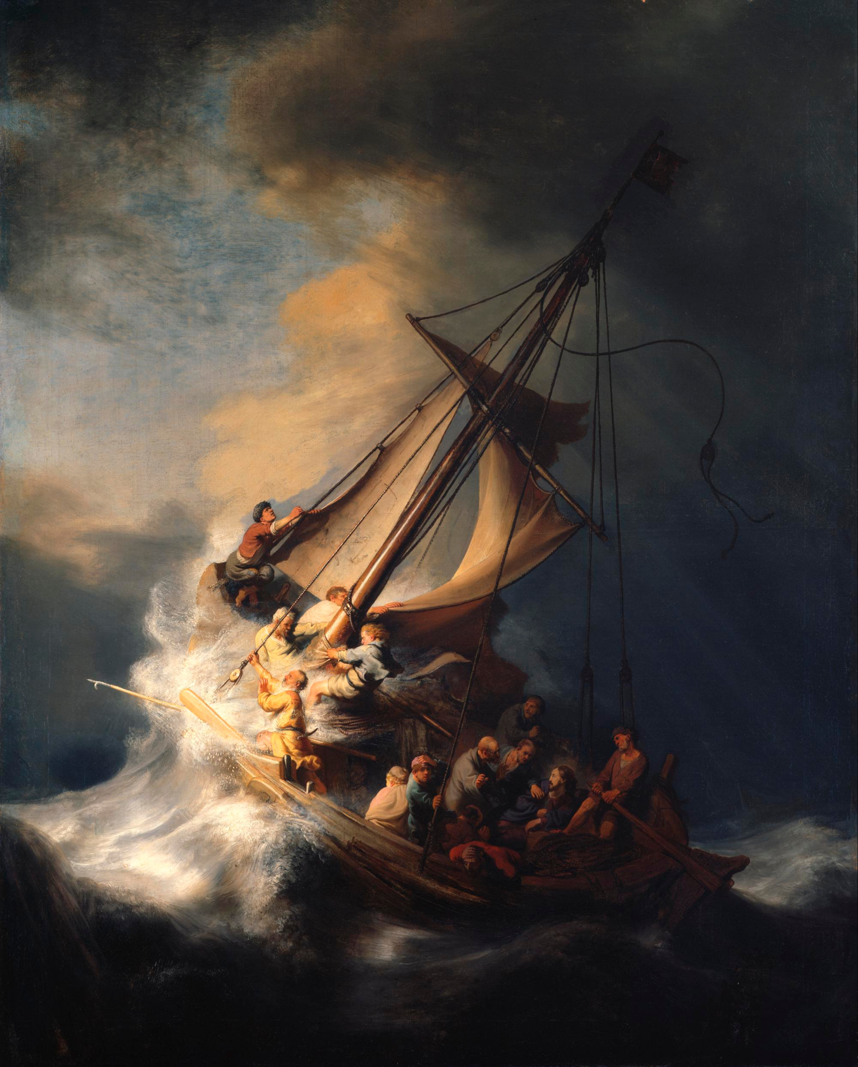
I have sometimes heard people say that they like certain artists because those artists cover their drawings with lots of detail. There' nothing wrong with that opinion, taste is totally subjective and I don't believe there's a "right and wrong" with art. Personally I tend to disagree with the idea that blanket detail is a good thing, though, because I think smart artists make choices....and covering everything evenly with detail is not really making a choice.
It seems that as a general rule, contrast is a key to creating works of art that are interesting to look at, and of course a contrast is created when you have blank spaces against areas of detail, as opposed to a piece of art that is all detail, or a piece that is all blank open areas.
I always hate to pick on artists, especially really good ones, and it always gets me hate mail, but as an example of what I mean, sometimes I feel the great Jack Davis uses too much detail. At least for my taste.
If it wasn't for the colors applied to this drawing, you wouldn't know where to look. The level of detail is really high (and evenly distributed) on every inch of the piece.
I can only imagine that the reason some people love a high level of detail is that some people like to look at a drawing and really spend some time with it, absorbing every detail and finding little jokes hidden by the artist. Personally, I don't. I really like art that makes a strong statement and one is which each area has an order of importance...I like it when an artist is clear about where to look first, and then where your eye should go secondarily, etc. I like it when artists make strong choices and direct your eye through their choices. To me, this Davis cover below is a mess. The values and levels of detail are all the same.
Here's a much better Jack Davis, in my opinion. The figure in the foreground has the most detail and the most black-on-white contrast, so my eye goes there first. Then the figure at the top left has the second highest level of detail and some black-on-white, but less than the central character. The rest of the piece has no areas of black-on-white and has thinner line work so it doesn't draw your eye until you've seen the other two more important figures that tell the story. The pile of bodies and street scene are just background that contribute to the idea, but don't overwhelm the more important figures.
That last piece leads nicely into another thought about detail...detail can be very helpful at getting your viewer to look where you want them to look.
It's always a challenge to get the viewer's eye to go to the part of a drawing (or painting) that is exactly where we want them to look. And putting detail where you want to attract the eye is a good, foolproof trick. And so, for that to work, the areas where you don't want the audience to look need to be blank, or at least have less detail than the areas where you want them to look.
Detail can also be helpful for indicating scale....things with a lot of detail tend to look bigger, if they're placed next to objects with less detail for contrast.
Detail also makes things seem closer to the viewer. Blank areas, by contrast, feel farther away.
Another thing I've heard people say is that drawings look more "realistic" to them when there's more detail on every bit of the drawing...but again, I don't see it that way. I've often read that our eyes don't even work that way. When we look at things in real life, our eyes (supposedly) see whatever we're focusing on in great detail, but the rest of our field of vision is slightly blurred and out of focus (and it increases more on the edges of our vision). If we saw everything in stark detail all the time we'd probably have a headache all the time (our eyes seem to work like our ears - we filter out most of the sound we hear and just focus on what's important).
To me, what makes a drawing look "realistic" to me has more to do with proportions. Personally I always found, for example, Milt Caniff's drawings to be very "realistic" because the proportions are pretty "straight": not only are the figures a realistic height, but the features of the face are realistically small, not really caricatured (although he does have some cartoonier characters from time to time). I like Caniff's level of detail, it feels right and not like he's trying to overdo it in an attempt to be "realistic". He lets the proportions do that for him. Also, he uses silhouette in a smart way to minimize areas of detail. It feels like he's making choices and using design to caricature reality, not try to capture it verbatim.
Usually when artists draw pretty girls they don't put a lot of detail on their faces to keep them looking young and pretty. Too many lines on the face can start to read like wrinkles, or blemishes, or sweat, etc. So usually it's proportions that artists have to use to get that "realistic" feeling.
In this Bernet drawing below, you can see the difference between how many lines he uses on the men's faces and how many he uses on the girl's: hers has much less detail. But he uses a lot of lines on her hair and clothes to balance it out and so they both feel like they belong in the same drawing.
These Alex Toth pages have a great balance of blank black areas, blank white areas and areas of controlled detail. As an overall design, they're very easy to follow and pleasing to the eye because they have a good balance of blank areas and detailed areas.
Some more good examples, by Quentin Blake and N.C. Wyeth.
you can discover your new favorite mini comic and get to know the artist personally.
Showing posts with label Ronald Searle. Show all posts
A Kick in the Head, Part Five
A couple of posts ago I encouraged you to draw with more appeal; this post is all about making your poses more expressive.
I think most people don't draw as expressively as they can. They don't push their poses and expressions to the point that they could and ambiguous drawing is the result. We all know that one of the hardest parts about drawing is crafting an image where anyone that looks at it can tell exactly what the characters are thinking and feeling. It's not easy, and like all the other posts in this series, that's why I'm bringing it up.
Sometimes I think people restrain their drawings because they want their drawings to look "pretty", and they're afraid that pushing the expressions too far will make for an "ugly" drawing.
To me, nothing could be further than the truth. I really love drawing pushed expressions, in fact, without that, I don't think drawing would be much fun. My favorite drawings of mine are the ones that have the most caricatured expressions.
Drawing expressively doesn't mean giving every drawing over-the-top broad wacky expressions, it just means that whatever the feelings and attitude of the character you're drawing, every element of their body (their face, their posture, etc.) reflects what they're feeling, and their attitude is very clear to whoever looks at the drawing. But the expressions should be appropriate; subtle for a subtle expression and pushed further for a more extreme expression.
Maybe another reason that expressiveness gets lost is that people are trying to draw "realistically" and they think only "cartoony" drawings are expressive. But real people can actually be pretty expressive. Also, we're not trying to recreate realism, every drawing is a caricature of reality on some level and every piece of art we create should be making a statement, right? Isn't that what makes it "art"? Besides, photography (and our own eyes) are great at capturing realism. Recording the world on paper exactly as we see it seems like a silly reason to draw.
It's possible that some comic books may have had a bit of a negative influence on expressive drawings. Sometimes comic book drawing is really technically good but without a lot of pushed expressions. I think sometimes artists that gravitate towards comics get really interested in drawing anatomy, vehicles, environments and dynamic angles but acting and emotions on the character's faces seem to be a low priority. I've seen really great looking comics that are drawn well but you can only tell what the characters are feeling by reading their dialogue balloons.
Of course, there are also plenty of great comic book artists who draw "realistically" and dynamically but also with great expressions that totally communicate to the viewer.
Will Eisner - a real master of finding the balance between drama, realism and caricature.


Jordi Bernet


There are a lot of other great comic artists who are good at this, I know. Alex Toth and Joe Kubert are also artists that can draw realistically, dramatically and also expressively.
Some other examples of expressive drawing:
Andre Franquin


Chuck Jones

Bill Peet


Quentin Blake


Ronald Searle


Sorry, these aren't the greatest examples, and I know I always return to the same artists over and over again as examples - I'm always pressed for time in scanning and posting. I'll try to broaden my examples in the future.
As always, look to real people and real actors to inspire you in finding great expressions.
It's always educational to see an actress who can remain attractive and appealing while being expressive. Two actresses who do a great job playing quirky characters with unique and odd expressions and pull it off in an appealing way:
Natalie Portman in "Garden State". She did a great job of using her face to show the oddball nature of her character but doing it in a really charming way.


When you think of the acting style Natalie used in the "Star Wars" movies it becomes even more apparent that her expressiveness in "Garden State" was a choice because it fit the character. In the "Star Wars" movies her character was a leader who was royalty and had to always appear strong and in charge, and always formal in all of her relationships. I point this out to illustrate that her odd and quirky expressions in "Garden State" were a conscious choice and not just her default acting style. It's a good illustration of the point that different characters have different levels of caricature that are appropriate to their personality and environment.
Gillian Jacobs in "Community"


More Community screencaps can be found at the Fishstick Theatre.
She has a great face and on the show she seems to always have a bit of a tweaked expression on her character's face even when she's just sitting and listening to another character talk. Her expressions are never symmetrical...always a bit off-kilter, which fits perfectly with her quirky character Britta.
A quirky, oddball character has a certain range and type of expressions that are appropriate for that character but wouldn't be right for other types of characters. And if all your characters have tweaky, weird expressions, then they don't seem quirky, they just become your style of expression because they don't have straighter, more subtle expressions to contrast with. So find the right range and type of expression for each character and each project. Again, push yourself - don't draw the same stock faces and gestures over and over. Study, observe and find new ones!
Drawing expressively is a lot like drawing appealingly, in that I've never heard someone say "Oh, that guy draws too appealingly" or "that guy draws too expressively". You can never have enough of those things; they both make drawings great.
I think most people don't draw as expressively as they can. They don't push their poses and expressions to the point that they could and ambiguous drawing is the result. We all know that one of the hardest parts about drawing is crafting an image where anyone that looks at it can tell exactly what the characters are thinking and feeling. It's not easy, and like all the other posts in this series, that's why I'm bringing it up.
Sometimes I think people restrain their drawings because they want their drawings to look "pretty", and they're afraid that pushing the expressions too far will make for an "ugly" drawing.
To me, nothing could be further than the truth. I really love drawing pushed expressions, in fact, without that, I don't think drawing would be much fun. My favorite drawings of mine are the ones that have the most caricatured expressions.
Drawing expressively doesn't mean giving every drawing over-the-top broad wacky expressions, it just means that whatever the feelings and attitude of the character you're drawing, every element of their body (their face, their posture, etc.) reflects what they're feeling, and their attitude is very clear to whoever looks at the drawing. But the expressions should be appropriate; subtle for a subtle expression and pushed further for a more extreme expression.
Maybe another reason that expressiveness gets lost is that people are trying to draw "realistically" and they think only "cartoony" drawings are expressive. But real people can actually be pretty expressive. Also, we're not trying to recreate realism, every drawing is a caricature of reality on some level and every piece of art we create should be making a statement, right? Isn't that what makes it "art"? Besides, photography (and our own eyes) are great at capturing realism. Recording the world on paper exactly as we see it seems like a silly reason to draw.
It's possible that some comic books may have had a bit of a negative influence on expressive drawings. Sometimes comic book drawing is really technically good but without a lot of pushed expressions. I think sometimes artists that gravitate towards comics get really interested in drawing anatomy, vehicles, environments and dynamic angles but acting and emotions on the character's faces seem to be a low priority. I've seen really great looking comics that are drawn well but you can only tell what the characters are feeling by reading their dialogue balloons.
Of course, there are also plenty of great comic book artists who draw "realistically" and dynamically but also with great expressions that totally communicate to the viewer.
Will Eisner - a real master of finding the balance between drama, realism and caricature.


Jordi Bernet


There are a lot of other great comic artists who are good at this, I know. Alex Toth and Joe Kubert are also artists that can draw realistically, dramatically and also expressively.
Some other examples of expressive drawing:
Andre Franquin


Chuck Jones

Bill Peet


Quentin Blake


Ronald Searle


Sorry, these aren't the greatest examples, and I know I always return to the same artists over and over again as examples - I'm always pressed for time in scanning and posting. I'll try to broaden my examples in the future.
As always, look to real people and real actors to inspire you in finding great expressions.
It's always educational to see an actress who can remain attractive and appealing while being expressive. Two actresses who do a great job playing quirky characters with unique and odd expressions and pull it off in an appealing way:
Natalie Portman in "Garden State". She did a great job of using her face to show the oddball nature of her character but doing it in a really charming way.


When you think of the acting style Natalie used in the "Star Wars" movies it becomes even more apparent that her expressiveness in "Garden State" was a choice because it fit the character. In the "Star Wars" movies her character was a leader who was royalty and had to always appear strong and in charge, and always formal in all of her relationships. I point this out to illustrate that her odd and quirky expressions in "Garden State" were a conscious choice and not just her default acting style. It's a good illustration of the point that different characters have different levels of caricature that are appropriate to their personality and environment.
Gillian Jacobs in "Community"


More Community screencaps can be found at the Fishstick Theatre.
She has a great face and on the show she seems to always have a bit of a tweaked expression on her character's face even when she's just sitting and listening to another character talk. Her expressions are never symmetrical...always a bit off-kilter, which fits perfectly with her quirky character Britta.
A quirky, oddball character has a certain range and type of expressions that are appropriate for that character but wouldn't be right for other types of characters. And if all your characters have tweaky, weird expressions, then they don't seem quirky, they just become your style of expression because they don't have straighter, more subtle expressions to contrast with. So find the right range and type of expression for each character and each project. Again, push yourself - don't draw the same stock faces and gestures over and over. Study, observe and find new ones!
Drawing expressively is a lot like drawing appealingly, in that I've never heard someone say "Oh, that guy draws too appealingly" or "that guy draws too expressively". You can never have enough of those things; they both make drawings great.
Subscribe to:
Posts (Atom)