I was looking at a news story about this Frank Miller drawing from "The Dark Knight". It just sold for a record amount of money.
If you click on this thumbnail you can see a giant version of the panel.
The first thing that struck me when I glanced at it was the area of Robin's cape. It's so simply drawn - just an empty and interesting shape. There's no interior lines defining the fabric of her cape, which at first glance, might seem strange - especially when you look at all the lines on the inside of Batman's cape.
I know when I first started drawing, I learned how to draw things and then always drew them the same way each time...I struggled so much with learning anatomy and the overwhelming task of learning how to draw everything that if I found a way to draw something that worked, I stuck with it whenever I could.
When I first started drawing I read everything I could about how things were built and put together (especially the human body). When I went to life drawing I worked hard to draw everything so it was "put together right".
These are great things to work on and very important for making a good drawing. But there are other things that go into making a good drawing, and using design principles as you draw is very important. Once you start down the path of doing anything visual - anything at all - design comes into play, whether the person creating the visual is aware of it or not. So the best artists keep design elements in mind and use them to their advantage at all times.
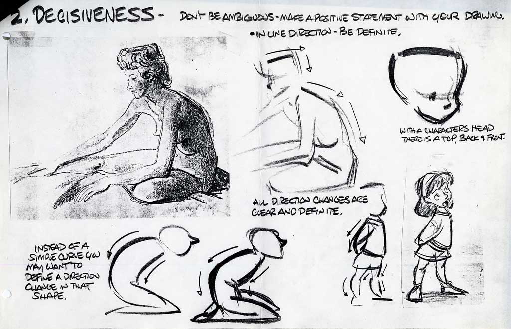
Life drawing by Glen Keane. A good example that a knowledge of anatomy plus use of design elements to create a beautiful drawing, instead of just a record of what's in front of you.
So when I looked at the Dark Knight illustration, the blank cape seemed like a really good example of (what I like to think of as) simple vs. complex.
I'm sure there's a better name for it, but that's how I think of it.
So, logically, you might think Frank Miller would fill in lines in the cape so that it looked just like Batman's cape. Logically, isn't it strange that two capes within the same drawing - presumably even made of the same material - would look pretty much the same and have the same line treatment? (These are the type of things I used to wonder all the time when I first started drawing). But it makes a lot of sense if you look at it with design in mind - you always want to lay simple areas next to complex ones.
In other words, put areas with a lot more detail next to areas with a lot less detail.
In the Frank Miller drawing, he uses lots of detail on Batman and Robin's forms to describe them. Therefore, since the cape overlaps Batman, it looks far better to have it create a clean swath of blank area laid over his areas of detail. It works really well to create the illusion that it's really overlapping his forms and that there's a three-dimensional, solid figure lying behind that cape.
Also, detail tends to draw our eye to it so Miller kept the detail isolated to the more important and interesting areas...the places he wanted your eyes to be attracted and to linger.
And then, since Batman's cape overlaps an empty night sky, it would have made no sense to keep his cape blank and free of interior lines. So Miller laid in some lines there to describe the form (and keep from having an empty space overlapping an empty space....that wouldn't be interesting and creates no sense of depth).
There's another good example of this in the background. Where the background skyscraper overlaps the skyscraper behind it in the distance, he left little blank "cushions" of white like a halo around the foreground skyscraper, so he wouldn't be creating a complicated area of detail right next to another. The little blank areas create a little breathing room between the two areas of detail.
Like most aspects of design, this concept is absurdly obvious. It wouldn't make any sense to put two complicated areas next to each other - that would be a confusing mess. It would be hard to tell where one area ended and the other began. For example, compare the two versions of the same sketch below:
You can see how the drawing with detail on every inch of the drawing is a mess and creates a ton of visual confusion.
Likewise, putting two blank areas next to each other is pretty meaningless. Neither space has more emphasis or weight and there's no statement being made. A page from a coloring book is a good example of why this looks pretty uninteresting.
Some more examples of simple vs. complex used well. Rembrandt:
Bill Watterson uses alternating areas of detail and empty space to suggest depth in the bottom panel:
Mignola (using a similar background treatment):
Jordi Bernet:
Blank doesn't always meant white...in this Bernet drawing, he uses both white and black shapes for his empty spaces. Throwing things into silhouette is a great way to minimize excessive detail and simplify your composition (the Mignola drawing above does this well too).
And here's a look at the final color version of the Frank Miller drawing. There's a subtle color variation within Robin's yellow cape, to keep it from becoming a flat lifeless shape, but not enough contrast to kill Miller's original concept of it as an empty space within the composition.
you can discover your new favorite mini comic and get to know the artist personally.
Showing posts with label Glen Keane. Show all posts
A Kick in the Head, Part Four
Will Finn did a great post recently about tangents. Great stuff.
These are some great handouts from Glen Keane that he handed out while I was at CalArts about drawing three dimensionally. These are high-res scans of my original copies; they can be printed on 8 1/2 x 11 or 11 x 17 paper if you're so inclined.
These say it all way better than I ever could. Again, this is an easy thing to get undisciplined about and let go. Nobody ever confronts you and says "hey, you stopped drawing three dimensionally, cut it out with all the flat drawing". Like a lot of things in life, if we can get away with something, we will. People won't usually go on a diet until their pants get too tight.
I think that drawing digitally (like in Photoshop) has made this problem more prevalent. The reason I don't like drawing in Photoshop is that I have to do a rough of each pose and then keep drawing over it with a new piece of paper each time, trying different things, and then finally I place one last piece of paper over my rough and do a more finished version. My roughs are too rough for actual storyboards, but that's okay, I like the roughing out part because I can experiment and it's easier to draw three dimensionally when I know I can just be drawing rough.
But that's not as easy with Photoshop. It's hard to look through more than one or two layers at a time in Photoshop (for me). I think it's hard for everyone else too, because it looks like most people go right to the cleaned up finished drawing in Photoshop because the roughing out and drawing over stage is very hard to do. I really think the drawings I see these days are cleaner and more polished but also more stiff and definitely not as three dimensional as they should be.


Why is this important?
Well, a drawing that works three dimensionally is always more solid and will always be a stronger drawing, for one. Obviously, if you're animating in 2D it's extremely important because as you animate your character needs to feel like its sitting in real space and if you can't draw your character from every angle then you'll never be able to turn them around as they move. But as more and more people animate in 3D this is becoming a lost discipline, I fear.
You could storyboard your whole career and never actually do a fully dimensional drawing. But I think there's a subtle effect that drawing solidly can have that makes your drawings feel more compelling and real to the viewer and really helps the audience buy the conceit that a drawing is thinking, feeling and having emotions. So I think drawing three dimensionally can make storyboards work better and connect more successfully with the audience.
I'm a bit of a crazy old crank though. I hate to blame Photoshop for everything but I think it's having a negative effect on drawing in general. Also I think I saw it buying cigarettes for minors once.
Subscribe to:
Posts (Atom)