 This week: Finally, the printer!
 Sorry about the corroded silvering in the hall mirror, it's the only one big enough for me to have taken a photo of me and the title card.
So, before I get to the week's topic, here's a photo of my stack of thank-you cards (before addressing.) Every single person who gave anything will be getting a personal note and a piece of Comic Tools original art.
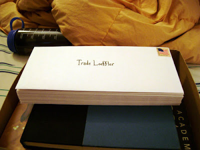 I sent these out a couple days ago, so if you don't get it in a couple weeks, maybe longer for the folks in Germany, Britain, Canada and Israel, let me know.
So this week I'm going to talk about two different but similar processes Jason Little and I are using to generate our original art, using a large format printer to take our small layouts and transfer them to our illustration board in pure cyan, so they act like rough blue pencils for our final art.
Why go to the expense and trouble? In my case it has to do with my working with a writer and an editor. Normally my thumbnails are inch and a half high scribbles, totally incomprehensible to someone who isn't me. For example:
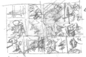 Obviously this isn't very helpful to an editor and writer who might like to actually see how I'm adapting the story into comics form.
My problem is, there's really not much at all in between this stage of drawing and a fairly finished drawing, for me. It's the same for my finished art, you see scribbles and marks and suddenly they're a mostly-formed drawing, without a lot of in between.
So, I started thumbnailing tight enough to be readable, and I realized "shit, these are basically rough pencils, and I'm gonna have to do almost 400 of these and then re-draw ALL of this AGIAN?!" Just thinking about it was deeply depressing, and made my thumbnailing work a miserable chore. I didn't want to put any effort into a whole body of art just to throw it away. I told my friend Hilary about my problems. At the time she was interning with Jason Little, and she suggested that a solution might be something like his method. She told me how he drew his layouts small but readable, scanned them in, cleaned them up and arranged them with word balloons and panels and everything in illustrator, and then printed them out in Cyan, so he could keep right on evolving those layouts into finished art. No wasted work. I decided there was no other way to go about it, that was my ticket.
Of course that meant getting access to a printer that could accomodate illustration boards, and you all know how that went.
A couple months ago I went to Jason Little's home and interviewed him about his process, both for myself and for Comic Tools. I'm going to take you through his process first, and then mine, so you can compare and contrast them, and see how each process meets our different needs.
Jason's process
First, here's a sample of what Jason's layouts look like. These are for his Shutterbug Bee comic Motel Art Improvement Service, which you can read part of here. Ye gods do I love Jason Little's comics. Jason's layouts are a great deal more readable than mine, I notice.
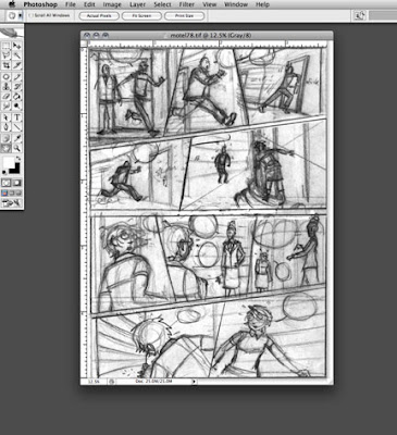 Jason then takes these layouts and converts the lines to pure cyan, and then drops the file into illustrator, where he begins positioning balloons and panels.
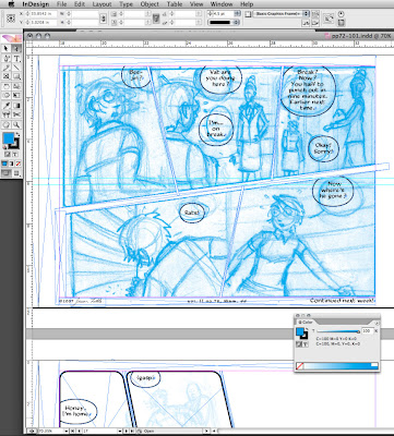
Here you can see the finished page, with the cyan lines turned lighter, all the panels and balloons arranged, and ready for printing. Unlike myself, Jason does not hand draw his balloons or his panel borders for Bee. Instead he actually prints them out in black in the same printout where he prints the cyan layouts. His printer is good enough quality that the lines will scan just fine later.
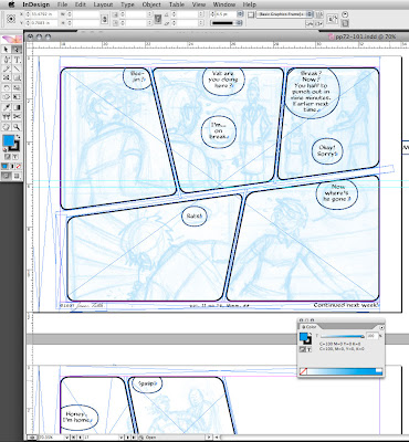
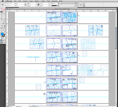
This is what his book looks like all spread out in illustrator:
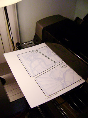
 As you'll see, Jason prints his layouts out much darker than me, which has to do both with that we'll both use different tools for our finished pencils, but also in how we like to build up a drawing. You can see how he prints the borders and balloons onto the illustration board.
Now, at this point I expected Jason to just hold up his finished page based on this printout and then that'd be the end of the entry and we'd call it a day. But then Jason asked me if I'd like him to draw and ink on it a little. I was totally flabbergasted by this generosity, and I sure as hell didn't say no. Here he is starting off with a blue pencil:
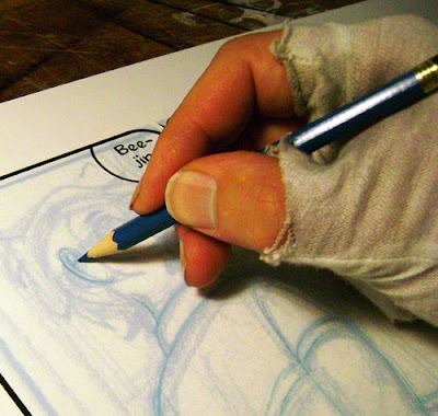
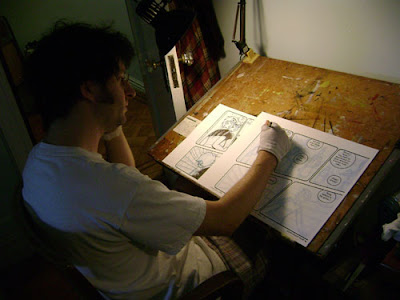 The blue pencil makes a slightly darker line than the cyan printout, so it's easy for Jason to refine the drawing. This is one place where Jason and I differ big time- I am NOT one of those artists who can draw a bunch of lines and then pick one. I always pick wrong when I try it, every single time. I draw a line, and if it doesn't work, I erase it. If I need to re-draw something, I erase and do again. My mind can't handle the clutter. You'll notice Jason wears a cotton glove to avoid smudging his oils onto the paper, and to avoid smudging the pencils as well.
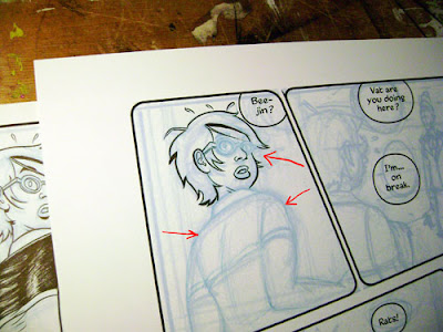
 At this point he started inking. You can see the sharper, darker pencil lines.
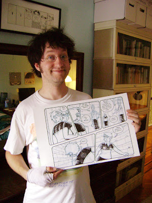
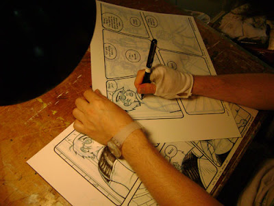 And here is Jason with the finished page from the comic:
 Matt's process
So, these are my layouts:
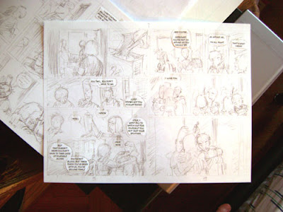
These are done at exactly print size, though in order to fit them onto a sheet of US letter size paper the margins aren't accurate, which I'll correct later. The lettering is arranged into balloons on the computer first and then printed out. My balloons are the start of every step in making a comic page for me- the first thing I thumbnail, the first thing I draw, the first thing I pencil, the first thing I ink. Printing them out and cutting them out gives me the advantage of being able to move them around and make minute corrections to placement without having to re-draw them, and allows me to use these thumbnails as tight layouts for my final art, because I know everything is the size it's going to be in print.
I have a VERY carefully measured corner of tape on my scanner glass that I dock the top right corner of every page to- this ensures that they scan the same every single time, and that the files can be easily handled in batches with automation.
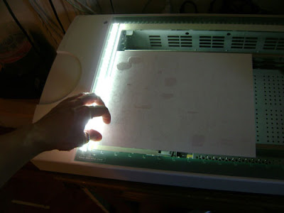
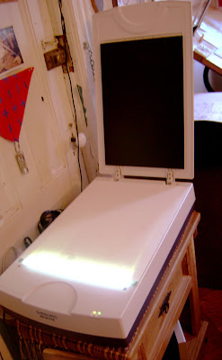
I put down a sheet of bristol in back of copy paper when I scan it,
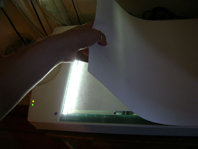
Because as you can see below, the inside of my scanner cover is black, and it darkens the image if you allow the scanner light to shine up through thin copy paper into the black. Bristol is basically opaque to a scanner so I never layer when scanning it, just copy paper.
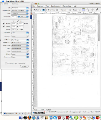
 Here in my scanner settings you can see that I've chosen to define the scanner boundary in pixels. Those numbers correspond to the first scan of my thumbnails that I did, and because I like to be able to handle every single file in the exact same way, I make all my thumbnail scans an identical number of pixels, rather than hand selecting the bounding box each time. Consistency is awesome when working with computers. Computers don't really do happy accidents.
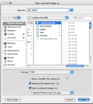
 All my scanned thumbs go into a folder called Rawthumbs300. This indicates that these are raw files to be kept unmodified in this folder, so that they'll always be around to be turned into a veriety of products, such as web-viewable thumbnails for my editor, or blueline files for my printer. The 300 indicates the DPI I scan them at. I don't use the First Second naming convention I use on all the other files, to emphasize that these are separate raw product not to be touched. Book 1 and book 2 of my project have separate rawthumbs300 files.
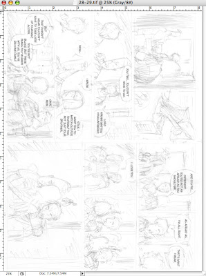
Here's what they look like when they come into photoshop as raw files:
And here's what they look like after they pass through a batch action I made just for turning them into blue lines:
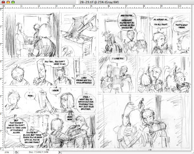
No, they're not blue lines YET, but it's very important that they go through a very specific set of levels and curves adjustments to come out exactly how I like them when I turn them blue. Now I take these files and put them into a template file for my blue lines, that I've set up so it prints within a milimeter's tolerance of the measurements for my final art:
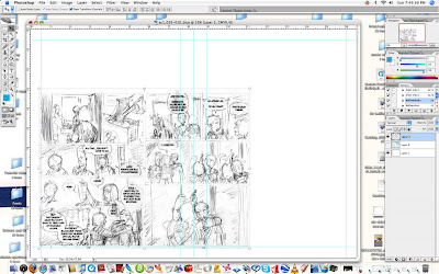
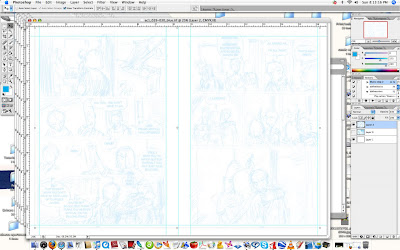
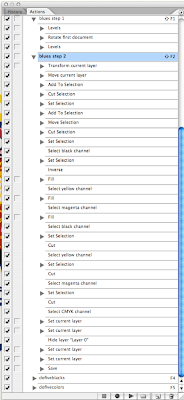
I drag the bottom left forner to align with the guides, and then I run another batch operation on the files. This operation is very complex, and in fact I learned that you could do a lot of things I had no idea you could do in a photoshop action when setting this up. The action resizes the layer, selects the right page only, drags it over and nudges it into perfect alignment with the margins,(which in this template are the accurate print margins for the book blown up to fit on my illustration board) deselects it, then goes through all the channels and changes all the linework into all cyan, then deletes everything from every channel except cyan, creating a fill channel. Then it makes opacity and fill adjustments to get it to the darkness I want. Finally, it saves the file as a ziptif, then selects the next file and does all the same to it, in batches of five, which I then check by eye and make any final adjustments as necessary, which they almost never are. Here's how they look after that:
 And here's the actions I have set up. You can see I have them set to run by key command, so I don't need to find the action in the list and click on it every time:
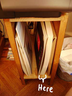
 Not it's time to print. See that big clot of pages below my printer? Those are the hand-cut illustration boards for my entire first book.
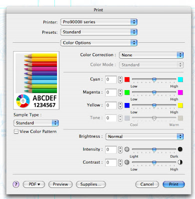
 Two important things about my print settings for this. One, I turn color correction off. If you try to print pure cyan with color correction on, the computer will try to make it more visually pleasing with some magenta dots here and there that you won't see until they make a mess of your scans.
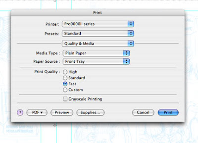
 Next, I want to use as little ink as possible, and since no one will see this stage of the art I set the print quality to fast. In order to do this I have to lie and say I'm using plain paper, but the bristol causes no damage to the printer. I'll also note, though it's not shown, that I have a special paper size selection custom made for these pages, the result being the prints land exactly where I want them on the page every single time.
 Here's my blank illustration board (except for page numbers written on it in pencil below where the pages will be) in the printer's dedicated large media path, which is FLAT. No bending!
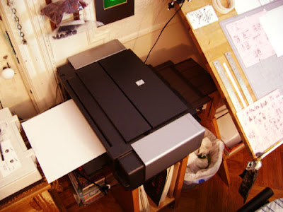 And here's the result:
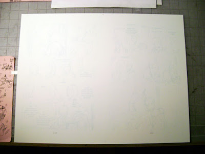
Why so light? Because I'm using graphite. I t took me five tries to get just the right balance where the lines weren't so light I lost detail and couldn't see anything, and not so dark that a pencil line made with no pressure at all wouldn't be darker than them. (otherwise I'd end up pressing wayyyyy too hard to make a finished drawing, in my attempts to make the art darker than the layout lines.) Here's some pencil lines made with no pressure, just lead on paper:
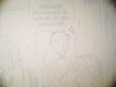 And without having to apply pressure to the eraser, they go away:
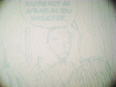
Just how it should be, enough to act as a firm guide but not get in my way.
And that is what I'm using the printer for! I'll show you samples of art as I make it.
Next week: Best cutter in the world