I think I have the only blog dedicated solely to the kind of information I post about, but I'm certainly not the only one posting about their tools and technique. And thank goodness for that, because the gaps in my knowledge are so big a drunk oil tanker pilot could careen through them without being in danger of hitting the edges. I love following artist's blogs not only to see their art and keep up on what's going on with them, but also because every so often they'll post a tip or tutorial, and very often they'll fill in those holes just a little bit more.
One of the hugest, most glaring gaps in my knowledge is ink wash drawing. I know how to work in Guache and watercolor, but ink wash is something I know nothing about. So when Comic Tools reader Andrew emailed me requesting an entry about ink wash drawing, I lit up the Comic Tools signal in a plea for help from the readers. And boy, did it pay off! Reader's Raluca and Sarah left great information from their experience in the comments for that entry, and then Mark linked me to the greatest tutorial I could possibly imagine, a 14 page exerpt from a larger text titled "Famous Artists on Wash Painting. " It's exactly the kind of hyper-detailed, excessively specific, sort-of-bossy old-fashioned art tutorial writing that I bade my writing for Comic Tools off of. Comic Tools is, in fact, a pale, crappy imitation of exactly this sort of thing. Mark, if you're reading this, I want to kiss you, and probably so does Andrew.
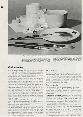 Andrew, I give you Part one and Part two of the ink washing lesson. Click on all the pages to make them larger. And Mark, bless you, sir, you are a scholar and a gentleman. I notice that the site the tutorials are posted on asks for donations- if anyone has the money, you really ought to toss them something for making these resources available. I'm going to root around their site when I have more time, and I'll very likely find more there that I'll want to link to here.
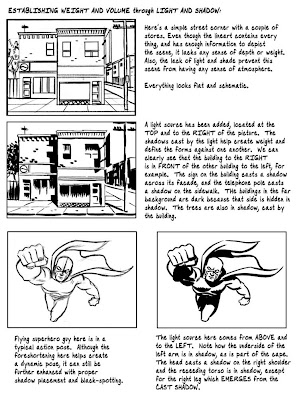
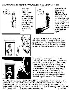
A problem that plagued me for years, and which still gives me some trouble, is knowing how to shade ink drawings. Where to put blacks, and why? The amazing , made this 3 page handout for his inking students explaining just that. I had been planning to cover some of this on Comic Tools, but there's no way I could have done this good a job. Here's a link to Cho's original post. Go and thank him for making this available to everybody.

 As long as I'm talking about Cho, I want you all to look at this sketch he did:
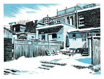
Makes you want to cry, right? Look How well-planned the blacks and whites are. Note how he hardly uses lines at all to describe forms, just light and texture. Look how unfussy yet neat his mark making on the brick is, how he changes it to fit the lighting. Look at the drybrushing he uses on the wooden fence and the overhang on the roof and in the clouds in the sky, how it gives the drawing softness and texture. This one sketch is like 30 Comic Tools entries rolled into one sublime expression of skill and control. And he calls it a "sketch." God damn you to hell Cho, you extraordinary son of a bitch.
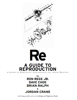
Here's something that every single cartoonist should have handy. Hell, they should have it memorized. It's a guide to photocopying, silkscreening, and offset printing by Ron Rege Jr., Dave Choe, Brian Ralph and Jordan Crane. You can download the PDF by going here: www.reddingk.com/img/reproguide.pdf. Whether you make minicomics or professionally printed books, no professional should be running around without knowing everything in this guide. Absolutely mandatory reading.
Another piece of mandatory reading is the infamous critique Alex Toth gave to Steve Rude. Rude sent the penciled pages of a Johnny Quest story to Toth, asking him what he thought. Toth let him know. Some see Toth's intense, brick-by-brick critique as being angry or hostile. Quite the contrary, Toth thought Rude a good artist, and respected Rude enough to take quite a lot of time to look at Rude's work very, very carefully. He saw Rude being lazy and taking shortcuts, and as Toth said right at the beginning, Rude was too good to be that bad. Toth's voice should be the internal monologue in our heads, pushing us out of laziness and into greatness, calling us on our bullshit, loving us. The last page of Toth's critique is the purest expression I've ever seen of exasperation at wasted potential. Toth wants to see the work he knows Rude CAN make, but doesn't. He is saying to Rude, GET UP. BE WHAT I KNOW YOU CAN BE. BE GREAT.
If you've ever wondered when you should bold text, or when to use a double dash versus an elipsis, or when to spell versus write out numbers in comics, then you should read this nifty guide to Comics Grammar and Tradition by Blambot's Nate Piekos. It answers all these questions and more, and contains tips from people such as master letterers Todd Klein and Clem Robins, and Dark Horse editor Scott Allie.
 Josiah Leighton wrote a post recently the got linked to pretty heavily, wherein he went panel-by-panel and described exactly why Jeff Smith is an amazing fucking cartoonist. It's kind of like the Toth Crititque or Steve Rude except good. But what I wanted you all to see was his summarizing paragraph, which may be the most concise, correct guide for how to frame a shot I've ever heard:
The lesson here, as I believe Smith so eloquently demonstrates, is follow your gut when it comes to framing shots. Imagine you are in the situations you have cooked up for your characters, and think about what you’d be looking at. If you’ve just reached the top of that mountain, you’re not going to be checking your shoes for dirt. Take in that scene. Would you even notice the wallpaper when you’re dining with a woman that beautiful? Show your reader what you would see, and only what you would see, through your eyes. And don’t think twice about moving that camera.
If you're not reading Josiah's blog, you should be. It's a comics course for free. I've paid for classes at SVA that taught me way less than any one of these articles on action in comics.
Go and pillage his blog for everything it has to teach you.
For years I used photoshop without knowing about any of the key commands. My room mate Erika Moen eventually clued me in to them. Don't be embarrassingly ignorant like me. Here's a nifty little guide to photoshop key commands. They will make your life easier.
Craig Thompson linked to my interview with him, and when he did he posted a photo of this great thing he has on his brush to help with his hand pain.
 Craig is often posting process sketches and before-after pages to show his process, and anyone who likes Comic Tools should peruse his old posts and add his blog to their reader.
That's all for this week! Come back next week when I talk about How to get the Perfect White Out Consistency.
If you're not reading Josiah's blog, you should be. It's a comics course for free. I've paid for classes at SVA that taught me way less than any one of these articles on action in comics.
Go and pillage his blog for everything it has to teach you.
For years I used photoshop without knowing about any of the key commands. My room mate Erika Moen eventually clued me in to them. Don't be embarrassingly ignorant like me. Here's a nifty little guide to photoshop key commands. They will make your life easier.
Craig Thompson linked to my interview with him, and when he did he posted a photo of this great thing he has on his brush to help with his hand pain.
 Craig is often posting process sketches and before-after pages to show his process, and anyone who likes Comic Tools should peruse his old posts and add his blog to their reader.
That's all for this week! Come back next week when I talk about How to get the Perfect White Out Consistency.