Our always popular Action Philosopher “Plato Smash!” t-shirts are now back in stock after being out of print for a while – now available in youth and adult XXL sizes! More designs will be added soon!
you can discover your new favorite mini comic and get to know the artist personally.
T-Shirts Back In Stock!
Our always popular Action Philosopher “Plato Smash!” t-shirts are now back in stock after being out of print for a while – now available in youth and adult XXL sizes! More designs will be added soon!
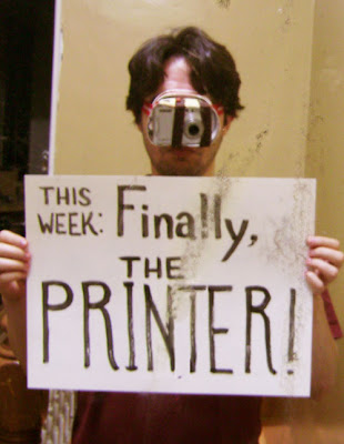 This week: Finally, the printer!
 Sorry about the corroded silvering in the hall mirror, it's the only one big enough for me to have taken a photo of me and the title card.
So, before I get to the week's topic, here's a photo of my stack of thank-you cards (before addressing.) Every single person who gave anything will be getting a personal note and a piece of Comic Tools original art.
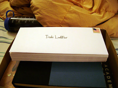 I sent these out a couple days ago, so if you don't get it in a couple weeks, maybe longer for the folks in Germany, Britain, Canada and Israel, let me know.
So this week I'm going to talk about two different but similar processes Jason Little and I are using to generate our original art, using a large format printer to take our small layouts and transfer them to our illustration board in pure cyan, so they act like rough blue pencils for our final art.
Why go to the expense and trouble? In my case it has to do with my working with a writer and an editor. Normally my thumbnails are inch and a half high scribbles, totally incomprehensible to someone who isn't me. For example:
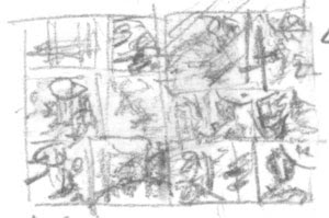 Obviously this isn't very helpful to an editor and writer who might like to actually see how I'm adapting the story into comics form.
My problem is, there's really not much at all in between this stage of drawing and a fairly finished drawing, for me. It's the same for my finished art, you see scribbles and marks and suddenly they're a mostly-formed drawing, without a lot of in between.
So, I started thumbnailing tight enough to be readable, and I realized "shit, these are basically rough pencils, and I'm gonna have to do almost 400 of these and then re-draw ALL of this AGIAN?!" Just thinking about it was deeply depressing, and made my thumbnailing work a miserable chore. I didn't want to put any effort into a whole body of art just to throw it away. I told my friend Hilary about my problems. At the time she was interning with Jason Little, and she suggested that a solution might be something like his method. She told me how he drew his layouts small but readable, scanned them in, cleaned them up and arranged them with word balloons and panels and everything in illustrator, and then printed them out in Cyan, so he could keep right on evolving those layouts into finished art. No wasted work. I decided there was no other way to go about it, that was my ticket.
Of course that meant getting access to a printer that could accomodate illustration boards, and you all know how that went.
A couple months ago I went to Jason Little's home and interviewed him about his process, both for myself and for Comic Tools. I'm going to take you through his process first, and then mine, so you can compare and contrast them, and see how each process meets our different needs.
Jason's process
First, here's a sample of what Jason's layouts look like. These are for his Shutterbug Bee comic Motel Art Improvement Service, which you can read part of here. Ye gods do I love Jason Little's comics. Jason's layouts are a great deal more readable than mine, I notice.
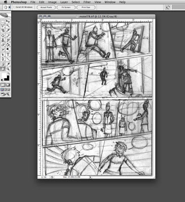 Jason then takes these layouts and converts the lines to pure cyan, and then drops the file into illustrator, where he begins positioning balloons and panels.
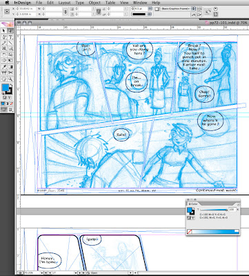
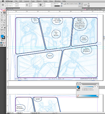
Here you can see the finished page, with the cyan lines turned lighter, all the panels and balloons arranged, and ready for printing. Unlike myself, Jason does not hand draw his balloons or his panel borders for Bee. Instead he actually prints them out in black in the same printout where he prints the cyan layouts. His printer is good enough quality that the lines will scan just fine later.
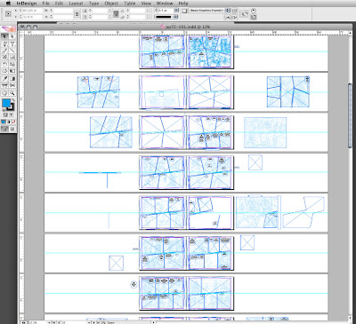
This is what his book looks like all spread out in illustrator:
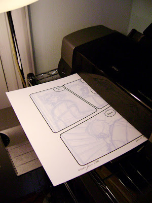
 As you'll see, Jason prints his layouts out much darker than me, which has to do both with that we'll both use different tools for our finished pencils, but also in how we like to build up a drawing. You can see how he prints the borders and balloons onto the illustration board.
Now, at this point I expected Jason to just hold up his finished page based on this printout and then that'd be the end of the entry and we'd call it a day. But then Jason asked me if I'd like him to draw and ink on it a little. I was totally flabbergasted by this generosity, and I sure as hell didn't say no. Here he is starting off with a blue pencil:
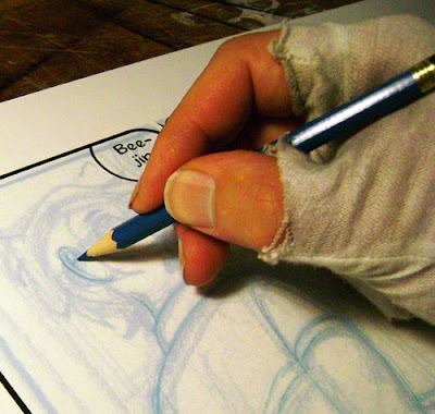
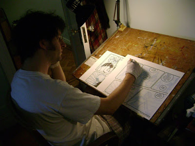 The blue pencil makes a slightly darker line than the cyan printout, so it's easy for Jason to refine the drawing. This is one place where Jason and I differ big time- I am NOT one of those artists who can draw a bunch of lines and then pick one. I always pick wrong when I try it, every single time. I draw a line, and if it doesn't work, I erase it. If I need to re-draw something, I erase and do again. My mind can't handle the clutter. You'll notice Jason wears a cotton glove to avoid smudging his oils onto the paper, and to avoid smudging the pencils as well.
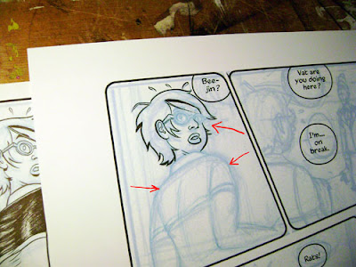
 At this point he started inking. You can see the sharper, darker pencil lines.
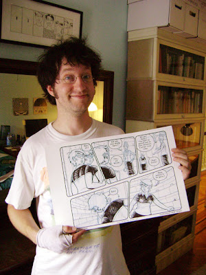
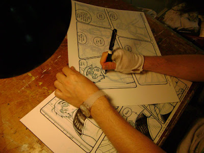 And here is Jason with the finished page from the comic:
 Matt's process
So, these are my layouts:
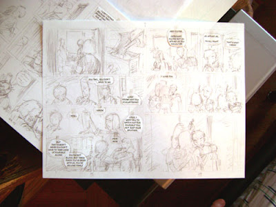
These are done at exactly print size, though in order to fit them onto a sheet of US letter size paper the margins aren't accurate, which I'll correct later. The lettering is arranged into balloons on the computer first and then printed out. My balloons are the start of every step in making a comic page for me- the first thing I thumbnail, the first thing I draw, the first thing I pencil, the first thing I ink. Printing them out and cutting them out gives me the advantage of being able to move them around and make minute corrections to placement without having to re-draw them, and allows me to use these thumbnails as tight layouts for my final art, because I know everything is the size it's going to be in print.
I have a VERY carefully measured corner of tape on my scanner glass that I dock the top right corner of every page to- this ensures that they scan the same every single time, and that the files can be easily handled in batches with automation.
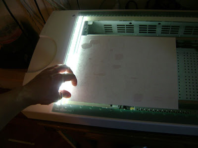
I put down a sheet of bristol in back of copy paper when I scan it,
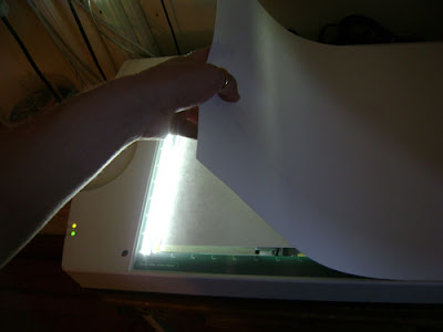
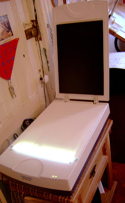
Because as you can see below, the inside of my scanner cover is black, and it darkens the image if you allow the scanner light to shine up through thin copy paper into the black. Bristol is basically opaque to a scanner so I never layer when scanning it, just copy paper.
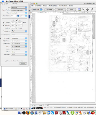
 Here in my scanner settings you can see that I've chosen to define the scanner boundary in pixels. Those numbers correspond to the first scan of my thumbnails that I did, and because I like to be able to handle every single file in the exact same way, I make all my thumbnail scans an identical number of pixels, rather than hand selecting the bounding box each time. Consistency is awesome when working with computers. Computers don't really do happy accidents.
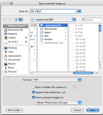
 All my scanned thumbs go into a folder called Rawthumbs300. This indicates that these are raw files to be kept unmodified in this folder, so that they'll always be around to be turned into a veriety of products, such as web-viewable thumbnails for my editor, or blueline files for my printer. The 300 indicates the DPI I scan them at. I don't use the First Second naming convention I use on all the other files, to emphasize that these are separate raw product not to be touched. Book 1 and book 2 of my project have separate rawthumbs300 files.
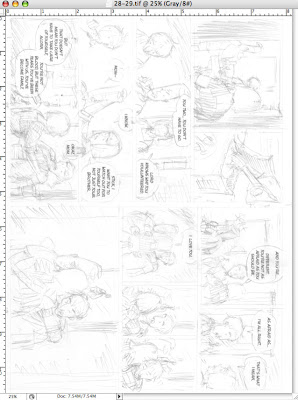
Here's what they look like when they come into photoshop as raw files:
And here's what they look like after they pass through a batch action I made just for turning them into blue lines:
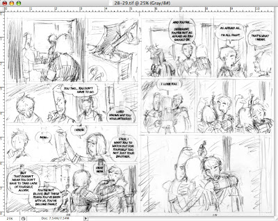
No, they're not blue lines YET, but it's very important that they go through a very specific set of levels and curves adjustments to come out exactly how I like them when I turn them blue. Now I take these files and put them into a template file for my blue lines, that I've set up so it prints within a milimeter's tolerance of the measurements for my final art:
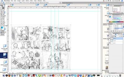
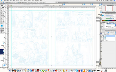
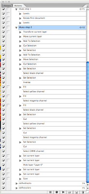
I drag the bottom left forner to align with the guides, and then I run another batch operation on the files. This operation is very complex, and in fact I learned that you could do a lot of things I had no idea you could do in a photoshop action when setting this up. The action resizes the layer, selects the right page only, drags it over and nudges it into perfect alignment with the margins,(which in this template are the accurate print margins for the book blown up to fit on my illustration board) deselects it, then goes through all the channels and changes all the linework into all cyan, then deletes everything from every channel except cyan, creating a fill channel. Then it makes opacity and fill adjustments to get it to the darkness I want. Finally, it saves the file as a ziptif, then selects the next file and does all the same to it, in batches of five, which I then check by eye and make any final adjustments as necessary, which they almost never are. Here's how they look after that:
 And here's the actions I have set up. You can see I have them set to run by key command, so I don't need to find the action in the list and click on it every time:
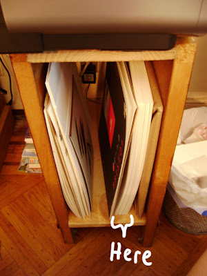
 Not it's time to print. See that big clot of pages below my printer? Those are the hand-cut illustration boards for my entire first book.
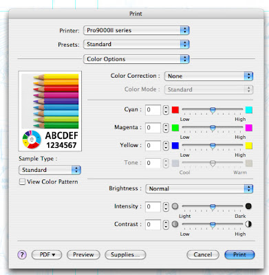
 Two important things about my print settings for this. One, I turn color correction off. If you try to print pure cyan with color correction on, the computer will try to make it more visually pleasing with some magenta dots here and there that you won't see until they make a mess of your scans.
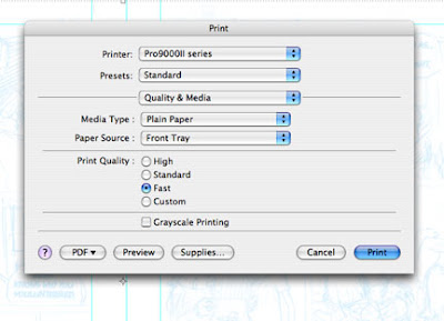
 Next, I want to use as little ink as possible, and since no one will see this stage of the art I set the print quality to fast. In order to do this I have to lie and say I'm using plain paper, but the bristol causes no damage to the printer. I'll also note, though it's not shown, that I have a special paper size selection custom made for these pages, the result being the prints land exactly where I want them on the page every single time.
 Here's my blank illustration board (except for page numbers written on it in pencil below where the pages will be) in the printer's dedicated large media path, which is FLAT. No bending!
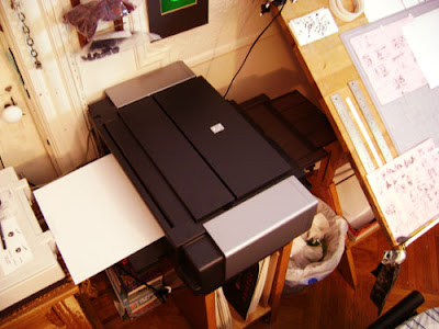 And here's the result:
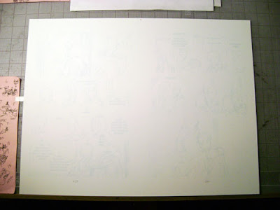
Why so light? Because I'm using graphite. I t took me five tries to get just the right balance where the lines weren't so light I lost detail and couldn't see anything, and not so dark that a pencil line made with no pressure at all wouldn't be darker than them. (otherwise I'd end up pressing wayyyyy too hard to make a finished drawing, in my attempts to make the art darker than the layout lines.) Here's some pencil lines made with no pressure, just lead on paper:
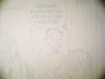 And without having to apply pressure to the eraser, they go away:
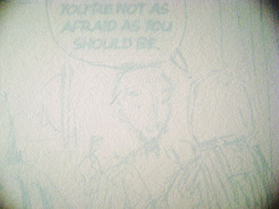
Just how it should be, enough to act as a firm guide but not get in my way.
And that is what I'm using the printer for! I'll show you samples of art as I make it.
Next week: Best cutter in the world
 This Week: Eraser Rub Off
Howdy Comic Tools readers! Before I get to today's entry, I thought I'd show you the result of all your generosity, my new large format printer, paid for entirely by donations for all of you!
Check this sweet purring cadillac of a printer out:

It's a Canon PIXMA Pro9000 Mark II. Normally it'd sell for $500 new, but I got this one on Ebay for $319 with shipping. It came brand new in box. It is, by far, the most advanced piece of technology I've ever handled. Printers sure have come a long way since I last checked. Before getting this printer, I thought Epsons were about as good as you could get in printers, and man have I re-thought that. Epsons are the Geos to this thing's Mercedes.
Every door opens slowly on it's own after a gentle press, no forcing anything open or clattering, almost-fitting joints. The print head is easily accessed and replaced, should there ever be need of it, with a simple lever. It has 8 individual dye-based ink cartridges:

All of which light up when inserted to indicate their circuitry is functioning:
 It has a dedicated paper path for large format and thick media, and here you can see my first print going through it!:
I still need o work on sizing to get the dimensions right on the page, but here's some pencil and ink doodling I did to give you an idea of where I'm headed with this process:

Canon ink is lightfast and archival, and the printer uses the least ink per page out of any brand of inkjet. I could not be happier with this thing.
Seriously folks, I was in one of those "I'm totally screwed and there's nothing I can do" tight spots in life, and you totally yanked my ass out. Everyone who gave will be getting a personal response in the mail and a bit of original art used in the making of a Comic Tools entry.
In the meantime, thank you, thank you everybody.
Now, moving on to this week's topic.
Awhile back my friend Joe was lamenting that he was on his last Sakura Eraser:

I'd never heard of the thing. Like many art students I'd been introduced to the Staedtler eraser for all my hard rubber eraser needs and I'd never tried anything else. (for those of you who don't know what a hard rubber eraser is and why it's different, basically there's only 2 kinds of erasers that are worth having around for erasing pencils for scanning. One is a gum rubber eraser, which if you're not a hard-presser and you use robust paper is all you'll need most of the time. The other is the rubber eraser, which you use to really work the pencil out of pencil lines that you drew too hard. Joe draws pretty hard most of the time, and as a result uses a rubber eraser almost exclusively to scrub his art down after inking.)
One day Joe lamented to me that he was about to use up his last Sakura, and he couldn't seem to find any more of them. I asked him to show one to me to compare it to a Staedtler, and the difference was that of night and day. Not only did the Sakura erase better, it created far less of the crumbly "dust" rubber erasers are infamous for, and it damaged the paper less too. I'd say the difference between the Sakura and the Staedtler was as large as the difference between a Staedtler and a pink pencil eraser like you might have used in school before you knew better.
I was saddened by the news that here was this amazing tool that vastly improved on a product I use all the time, that I had never heard of, and evidently it could not be found anymore. "This sounds like a job for Comic Tools blog.", I sid, and I wrote an email to the manufacturer asking about the eraser. a few days later I received this curt reply:
"SJ100 was discontinued and are no longer available. They are working on
a replacement product that is not available yet."
a replacement product that is not available yet."
A few weeks later Joe called me into his room to show me some new Japanese erasers he'd bought at Books Kinokuniya, which is the cheapest place in NYC to buy Japanese art supplies. He'd bought two erasers, a Tombo Mono and a Foam eraser. He showed me both, and the differences between them, and I decided then that a good comic tools entry would be to look at all the Japanese erasers you can buy now in the wake of the Sakura's disappearence, and see how they compare. I threw in the Staedtler for good measure. I should say that Joe says the Sakura was better than all of these, and he hopes very much whatever new product they're developing will show up soon. If anybody has a Sakura I'd love to hear your thoughts in the comments.
To prepare for the test I made samples of lettering and art that were drawn far too hard onto the paper, so that no normal gum rubber could erase them. These lines would need a hard rubber eraser to come out. I've adjusted these scans to match the darkness in real life: (to see all of these larger, click on them.)
Next, I inked the drawings and lettering: Next, I did a careful erasing of each, not stopping until I had gotten all the pencil totally gone. If you click to see the image below larger, you'll really see some differences in the scan. The Staedtler could not get all the pencil out, at all. It was too hard to press into the lines, and not sticky enough to grab the pencil lead. This test of the Foam seemed to confirm what Joe had said, which is that the Foam is TOO sticky- it sticks to the ink and starts pulling it from the paper when you use it roughly. You can see that the lettering has been compromised. I also rubbed off a LOT of eraser doing the job. The Tombo Mono, Joe's favorite in his own tests, looks great here, and worked nearly 3 times as fast as any of the others while leaving no ink damage. The pencil was gone out of the deepest gouges in a few passes. The Non-Dust Tombo didn't fare too badly either, although I rubbed off a lot more of the eraser doing the same job as the regular Tombo, which means I'd have to buy more of them.

After the erasing I took photos of the resulting dust. Here's the crumbly Staedtler and it's infamously infuriating messy dust, running like a crap waterfall down my table and off camera onto my lap:

Here's the foam eraser's rather large load of somewhat more manageable "dust,", actually more like rolled melted rubber, which is what it is: Here's the scant and manageable dust left by the Tombo Mono:
 And here's the notably long strands of rubber left by the Non-Dust:

For the next step, I scrubbed the middle of the drawing and lettering with all my body weight, ravaging the paper. If I'd been using regular bristol instead of the robust stuff I use I'd have ground the surface into flannel. I also added a lighter stroke of ink underneath and scrubbed it mercilessly too. Doing this, the Staedtler FINALLY did it's job and erased the pencil liall the way, but now my lettering was so rubbed off it didn't scan right anymore. Compare it to the untouched lettering above. That would have been ANY fine line in it's path. The foam did an even worse number on my ink, peeling ink from the lettering AND the drawing. FAR too sticky to be used safely with an ink drawing. The lettering in particular is now ruined. The Tombo did the best, with virtually no degredation and the least loss of material to the eraser. The Non-Dust did second best, although the lettering lightened a little and I lost a lot of eraser material.
To prepare for the test I made samples of lettering and art that were drawn far too hard onto the paper, so that no normal gum rubber could erase them. These lines would need a hard rubber eraser to come out. I've adjusted these scans to match the darkness in real life: (to see all of these larger, click on them.)

Next, I inked the drawings and lettering:
 Next, I did a careful erasing of each, not stopping until I had gotten all the pencil totally gone. If you click to see the image below larger, you'll really see some differences in the scan. The Staedtler could not get all the pencil out, at all. It was too hard to press into the lines, and not sticky enough to grab the pencil lead. This test of the Foam seemed to confirm what Joe had said, which is that the Foam is TOO sticky- it sticks to the ink and starts pulling it from the paper when you use it roughly. You can see that the lettering has been compromised. I also rubbed off a LOT of eraser doing the job. The Tombo Mono, Joe's favorite in his own tests, looks great here, and worked nearly 3 times as fast as any of the others while leaving no ink damage. The pencil was gone out of the deepest gouges in a few passes. The Non-Dust Tombo didn't fare too badly either, although I rubbed off a lot more of the eraser doing the same job as the regular Tombo, which means I'd have to buy more of them.
After the erasing I took photos of the resulting dust. Here's the crumbly Staedtler and it's infamously infuriating messy dust, running like a crap waterfall down my table and off camera onto my lap:

Here's the foam eraser's rather large load of somewhat more manageable "dust,", actually more like rolled melted rubber, which is what it is:
 Here's the scant and manageable dust left by the Tombo Mono:
 And here's the notably long strands of rubber left by the Non-Dust:
For the next step, I scrubbed the middle of the drawing and lettering with all my body weight, ravaging the paper. If I'd been using regular bristol instead of the robust stuff I use I'd have ground the surface into flannel. I also added a lighter stroke of ink underneath and scrubbed it mercilessly too. Doing this, the Staedtler FINALLY did it's job and erased the pencil liall the way, but now my lettering was so rubbed off it didn't scan right anymore. Compare it to the untouched lettering above. That would have been ANY fine line in it's path. The foam did an even worse number on my ink, peeling ink from the lettering AND the drawing. FAR too sticky to be used safely with an ink drawing. The lettering in particular is now ruined. The Tombo did the best, with virtually no degredation and the least loss of material to the eraser. The Non-Dust did second best, although the lettering lightened a little and I lost a lot of eraser material.

Just like in Joe's experience, the Tombo Mono is the clear winner. I'll let you all know if a new Sakura becomes available, and of course I'll test that too.
Next week: So what am I going to do with this printer, anyway?
You can stop now!
I mean, you know, if you still WANTED to donate that would be totally awesome and all, I'm certainly not taking those buttons down, but I have all I need for the printer and I've just ordered it.
I'll be writing a better note of thanks later this week and I'll be sending several of you extra special thank yous for your holy-shit generosity, but I wanted you all to know that I'm no longer in desperate straits in this matter, you have come to my rescue and covered my ass, and your charity should now be focused elsewhere.
What kind of printer is it, you ask? You'll find out when I do my post about printing blueline layouts.
Getting there!
Hey everybody, since Wednesday when I asked you all for help getting a printer after an expensive month long fiasco that I didn't even describe half of, Comic Tools readers have donated 100 dollars and forty three cents, which is a hair short of halfway to a brand new large format printer which will allow me not only to start finished art for my First Second book, but also to finish an amazing Comic Tools entry where, in researching the method I'm using to produce the art for my book, I visited Jason Little in his home, where he taught me how to do it, demonstrated by printing out a page of his own layouts, and then he actually penciled and inked part of a panel right then and there, with me photographing the whole thing.
I also have entries coming up such as an insanely in-depth review of different inks, how to choose perspectives in comic panels, and a HUGE multi part tutorial about scanning that will rival my anatomy tutorial.
I don't need any money to produce any of this content (this isn't PBS, you're not gonna have to deal with annual fund drives), but I do really honest to god need this new printer to do my job, and I've already spent more money on this misguided adventure than I can afford. In the last several days many of you have donated, some of you generously enough I may have to take a bullet for you or something. For those of you who haven't yet, if each of you donated five dollars it would put me into the clear and leave a little extra for ink. But any amount at all would still be closer, and deeply appreciated. This is a piece of professional equipment that I really need, and if you've enjoyed this blog and the content I've provided, maybe it's worth enough to you to help me out. You'd really be pulling me out of a ditch. To all of you who've already helped, holy moly smokes thank you thank you thank you. (To those of you who gave big, and who will give big- you have special packages coming to you in the near future. )
 This week: Balloon Shape.
This entry isn't about what you probably think it's going to be about. I suspect you think I'm either going to talk about the various shapes of balloons you can use in your comics, (round, cloud, square, unfurling scroll, etc.) or about how to compose your balloons within your comic panels.
Neither of those would be worth discussing on Comic Tools, not because they're not important, but because they're both extremely broad subjects of discussion which are very, very well discussed in many books and websites already. The reason I let myself get away with tutorials on comic tools is that I only talk about things I call "mental tools," little tips and tricks that you can keep in your mental toolbox and use to make your art easier and better. Subjects of broad aesthetic discussion are for the artist in you- Comic Tools blog is for the craftsman in you.
This week I want to bring something clearly into everyone's mental focus that they may or may not think of, but which very few people think of enough, if at all: The shape of the outline of the balloon is as important as the shape formed by the negative space inside the balloon, and the shape of the negative space inside the balloon is as important as the shape of the words inside the balloon. The words, the negative space, and the balloon's outline all have to combine into a single, pleasing form.
Many cartoonists, and most beginning cartoonists, look at text as something they have to either put over or cram into their art. This is because most young cartoonists "just want to draw," and don't want to have to deal with it. By the time anyone has gotten to a point of being even a little professional they've at least caved in to the idea that they actually have to leave room for balloons or their work will look like shit and be totally unreadable. Most even go to the effort to compose their pages by using the balloons as a visual element to lead the eye through the page, recognizing them as a part of the image and not just something they have to make room for.
But many professionals, even many good ones, stop there. They'll compose the balloons on the page, but they don't think about composing the balloon itself. And thus their balloons keep making their art look worse, and thus they keep hating text.
An average of 30% of your comic page might well be word balloon by area- it's worth taking the time not to make a third of your page look like garbage.
The problem with text, from a drawing perspective, is you can only do so much to change it, especially if you're working off a script you can't re-write. Those words are going to be that size and that spacing. You can't draw the word from a different angle, or from above, or in perspective to make it thinner. It's frustrating, how unmoldable they are, how undeterrably horizontal. All you can really do is stack them into a shape that's easy to draw a balloon around.
Most young cartoonists don't even TRY. I'm sure every one of you has seen a comic with one or more of these mistakes:
 The problem on the top left is different from all the others in that it's a mistake made by cartoonists who are just starting to try to address the relationship of their text to the balloon but don't quite have the hang of it. I did it for awhile and so did many of my classmates at SVA. It happens when you keep drawing your balloons around your words and leaving huge amounts of space around them here but almost crashing the edge against a letter somewhere else. The teacher or a fellow student will say "You need to be leaving more equal space around your words, imagine there's a forcefield around the letters you can't cross." But then you take them too literally and you draw these spandex-fit balloons that really are like drawing a forcefield around the text.
If you're still doing that? It's time to graduate. although it IS important you have space around your words, it's not important that the space around them be equal. It's important that the space around them, and the words themselves, form a pleasing shape.
Let's take a phrase and I'll show you what I mean.
Below I've misspelled "I am a very hot Paleontologist, yes." seven times, in different arrangements. I've eliminated some, approved of others, and I'm iffy on one. Have a look at them and then I'll explain why.
 Alright, now below are those same arrangements, but with the shape of the letters emphasized:
 1 is just a boring shape, and being rectangular it's hard to form a pleasing oval around. But it used space pretty efficiently, so I marked it as lukewarm, a shape I might use is I had to but one I'd avoid when composing my page.
2 and 3 are pointy, nasty shapes that waste previous room on my page with empty and not very artful lumps of negative space. I can do better, and I can think of no reason why I'd use them.
4 and 5 are both more efficient at using their space and form stable shapes that are easy to draw a balloon around. I like to plan versions that will float as well as versions that I can bodge against the panel border if I need to, so I have options when I got to compose the panel.
6 is another inefficent waste of space.
7 is not only a better shape, but it's more compact, despite being an extra line. Should I choose to put this balloon in a corner this will take up the least of my drawing and do so very attractively.
When composing a page I figure out the best balloon shapes for the text first, and I compose only with the ones that pass. This way I know for sure that the text will look great later- I've already eliminated all the bad options!
Doing this not only makes the page look better, it makes the page read better. Text that gets forgotten till later usually gets crammed in, and cramped text actually has quite a detrimental effect on a reader. Read these two balloons with identical text, and pay attention to your eye strain, and even your level of stress, as you read one, and then the other:

If you're running a balloon up against the side of a page you also have to decide whether you're going to have the letters run flush against the border or be centered in the balloon. You have to draw the balloon differently for both. Also, you either have to have the balloon up against the border or totally away from it, having them tough forms and unattractive and awkward to draw around tangent:

When everything is working well, the reader should notice as little as possible that they're even reading. It's for this reason that I'm also typically of the opinion that text should be kept absolutely as simple and innocuous as possible. The goal is to be not noticed, so as not to pull the reader out of the story.
 Using very regular, innocuous text also make composing much easier. However, as anyone who's read my comics knows, I DO think there's times where it's appropriate to draw attention to the text for effect:
 I think a lot of folks associate bad lettering with digital, or computer lettering, either as seen in crappy mainstream comics or in englich Manga translations where the letterer is rarely an artist, such as these examples:
 They're hilariously bad, to be sure. But let's not forget that plenty of great artists who did all their lettering by hand have made the same mistakes. Bill Watterson constantly ran out of room and had to bodge the rest of a long word in by drawing all the letters small, and Winsor McCay, one of the greatest cartoonists of all time, may well have been the worst letterer of all time. (Which is odd, since his title lettering was breathtaking. I think it's because he thought of the titles as drawing and his balloons as text.)
 I think it's just easier to see mistakes in digital lettering, and that mistakes look worse in digital lettering, because everything is so regular and clean. Doing things by hand gives you a little leeway.
Two of my favorite letterers who use digital are Steven Griffin and Bryan Lee O'Malley.
Just look at the letter shapes in this spread from Hawaiian Dick, which Steve colors and letters:
 They're immaculate. They sit there like perfect jewels. I envy the shit out of this guy. You can't see it here, but his colors make me foam at the mouth with jealous rage too.
I've always loved Bryan's combo if hand drawn balloons and computer text (some of the most tasteful computer text I've ever seen), but what's really unique and interesting about his lettering is how most of the time he composes his balloons so they only have one or two worse across running down his distinctive tall balloons in a punchy column.
 Sometimes he'll let them get wider and grow into fat circles, but unlike just about every letterer I've ever seen, O'Malley defaults to the vertical, rather than the horizontal. The result is that instead of reading a block of text, I meander through the character's words as they speak. It makes for a unique reading experience.
Next week: The marvelous erasers of Japan
Subscribe to:
Comments (Atom)